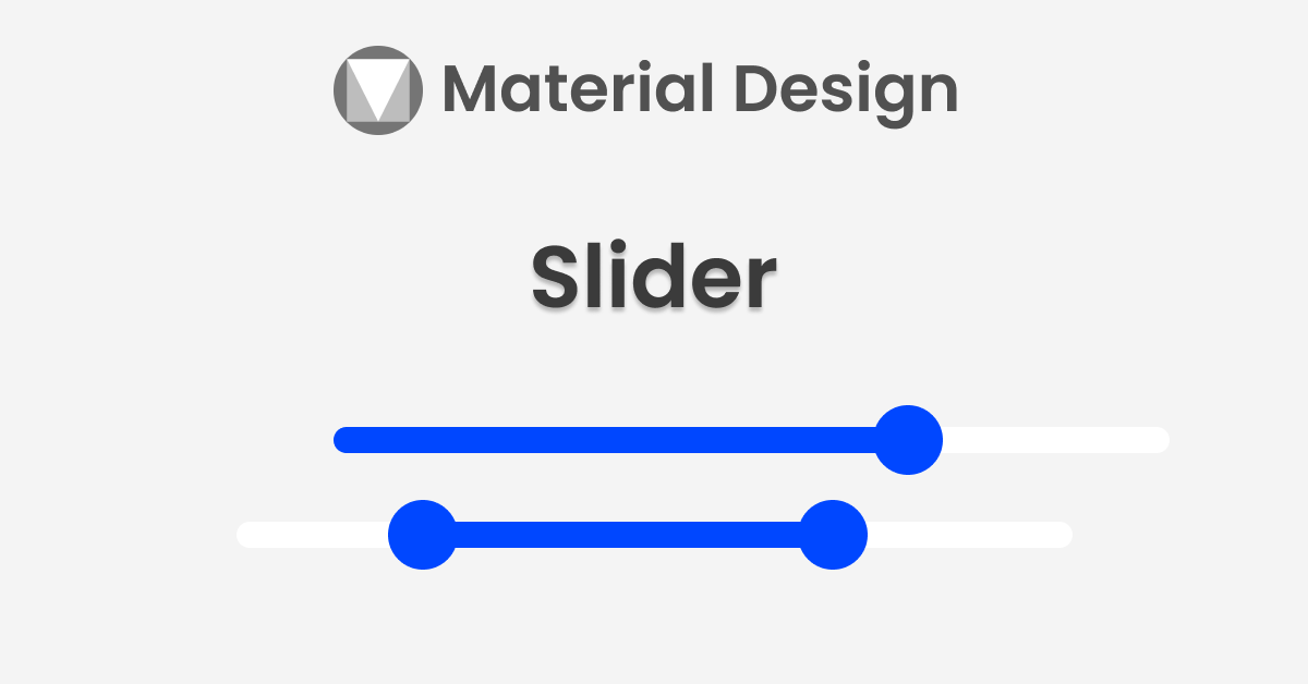
Sliders are used to view and select a value or range from the given slider bar. They’re mainly used for adjusting settings such as volume and brightness, etc.
Sliders can use icons on both ends of the bar to represent a numeric or relative scale. The range of values or the nature of the values, such as volume change, can be communicated with icons.
Sliders add to the Material design in library version 1.2.0 So, you need to add a 1.2.0 or higher version to the material design.
Before starting check out my other post on material design:
ShapeableImageView – Material components for android
Progress Indicators – Material Components For Android
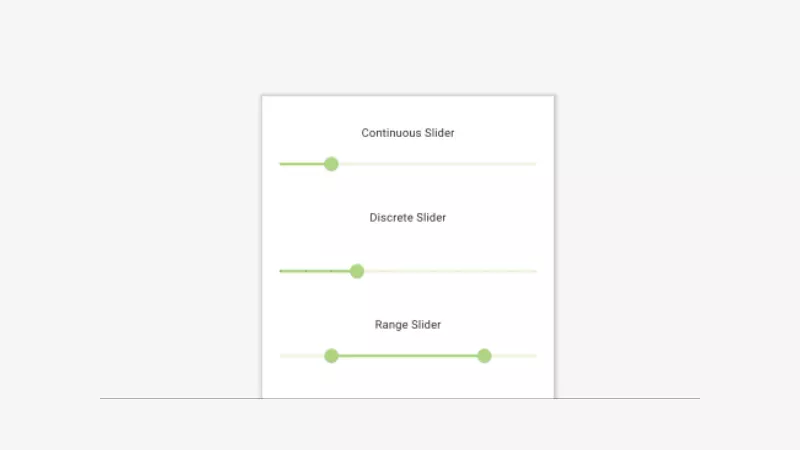
Types of sliders
There are two types of sliders.
- Continuous Slider
- Discrete Slider
Also, We have another slider called the range slider.
Let’s see about these sliders in detail.
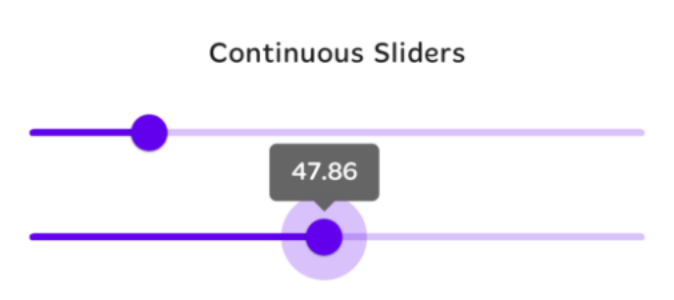
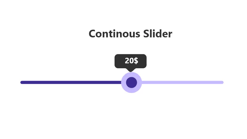
Continuous Slider
Continuous sliders allow us to select any value between the given start and end values.
For example, valueFrom = “0.0” and valueTo=”100.0″ in this case, you can select any values between from and to values like 55.5, 62.0, etc.
defining the slider In the layout,
<com.google.android.material.slider.Slider
            android:id="@+id/continuousSlider"
            android:layout_width="match_parent"
            android:layout_height="wrap_content"
            android:valueFrom="0.0"
            android:valueTo="100.0"
            android:value="20.0"/>
the layout,
valueFrom: starting value of the slider.
valueTo: ending value of the slider.
value: setting the initial value of the slider.
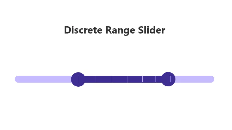
Similarly, we can add a RangeSlider in a layout:
<com.google.android.material.slider.RangeSlider
            android:id="@+id/rangeSlider"
            android:layout_width="match_parent"
            android:layout_height="wrap_content"
            android:valueFrom="0.0"
            android:valueTo="100.0"
            android:stepSize="10.0"
            app:values="@array/initial_range_slider_values" />
The RangeSlider has app:values to set the range for the slider. we need to provide the range in arrays.
values/arrays.xml:
<resources>
        <array name="initial_range_slider_values">
            <item>20.0</item>
            <item>80.0</item>
        </array>
    </resources>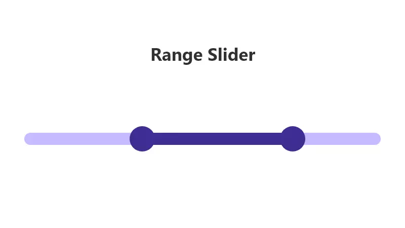
Values changes Listeners
We can observe the changes in the slider in two different ways.
addOnSliderTouchListener
by using addOnSliderTouchListener, we can observe the slider’s start and stop touch position values.
continuousSlider.addOnSliderTouchListener(object : Slider.OnSliderTouchListener {
                override fun onStartTrackingTouch(slider: Slider) {
                    // Responds to when slider's touch event is being started
                    Log.d("onStartTrackingTouch", slider.value.toString())
                }

                override fun onStopTrackingTouch(slider: Slider) {
                    // Responds to when slider's touch event is being stopped
                    Log.d("onStopTrackingTouch", slider.value.toString())
                }
            })
similarly, we can add a touch listener for the range slider.
rangeSlider.addOnSliderTouchListener(object : RangeSlider.OnSliderTouchListener{
                override fun onStartTrackingTouch(slider: RangeSlider) {
                    val values = rangeSlider.values
                    Log.d("onStartTrackingTouch From", values[0].toString())
                    Log.d("onStartTrackingTouch T0", values[1].toString())
                }

                override fun onStopTrackingTouch(slider: RangeSlider) {
                    val values = rangeSlider.values
                    Log.d("onStopTrackingTouch From", values[0].toString())
                    Log.d("onStopTrackingTouch T0", values[1].toString())
                }
            })
addOnChangeListener
Sliders OnChangeListener is notified every time the slider value changes.
continuousSlider.addOnChangeListener(object: Slider.OnChangeListener{
                override fun onValueChange(slider: Slider, value: Float, fromUser: Boolean) {
                    Log.d("addOnChangeListener", slider.value.toString())
                }
            })
Also, OnChangeListener for the RangeSlider.
rangeSlider.addOnChangeListener(object : RangeSlider.OnChangeListener{
override fun onValueChange(slider: RangeSlider, value: Float, fromUser: Boolean) {
val values = rangeSlider.values
Log.d("From", values[0].toString())
Log.d("T0", values[1].toString())
}
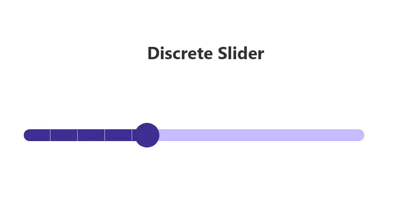
})Discrete Slider
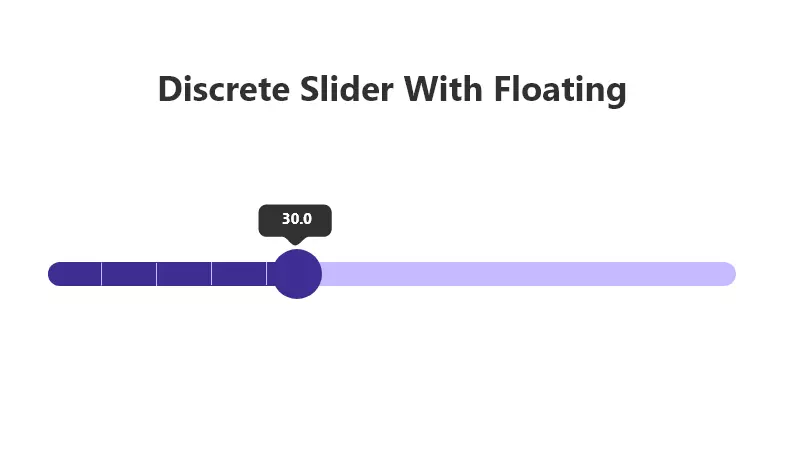
The discrete slider allows the user to select an exact value in the given input range.
If you want to slider to be discrete, then you need to add an attribute called android:stepSize=”5.0". This will set up the step between valueFrom and valueTo values based on the stepSize value.
For example, valueFrom = 10.0, valueTo = 50.0 and stepSize = 10.0, then you can able to select values 10.0, 20.0, 30.0, 40.0, 50.0 only.
defining discrete slider in the layout:
<com.google.android.material.slider.Slider
            android:id="@+id/discreteSlider"
            android:layout_width="match_parent"
            android:layout_height="wrap_content"
            android:valueFrom="0.0"
            android:valueTo="100.0"
            android:stepSize="10.0"
            android:value="30.0"
            />
Also, we can add discrete in the RangeSlider.
We can observe the discrete slider values change the same as a continuous slider. Please check the value changes Listeners above.
Setup the Slider Label
The label will be shown at the top of the slider thumb after you touch the thumb. Basically, the Slider layout holds the currently selected value of the slider.
We can change the behavior and label format using the below methods.
app:labelBehavior – You can change how it’s drawn via the app:labelBehavior attribute or setLabelBehavior method.
app:labelBehavior – has three different modes.
floating (default) — draw the label above the slider view.
withinBounds — draw the label within the slider view. So the label height will be included in the slider height.
gone — the label won’t display.
LabelFormatter
By using a LabelFormatter you can change the display format of the selected values based on your requirement like 10KG, 12MB, etc.
That can be achieved through the setLabelFormatter method. That can be achieved through the setLabelFormatter method.
continuousSlider.setLabelFormatter { value: Float ->
        return@setLabelFormatter "$${value.roundToInt()}"
    }
In the above code, I have rounded the selected values and converted them into dollars.
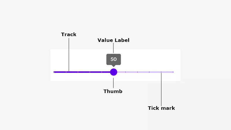
key properties of sliders
A Slider has four UI elements.
- Track
- Thumb
- Value Label
- Tick Mark (only for discrete slider)
Track Attributes
Thumb Attributes
Values Label Attributes
Tick Mark Attributes
Implementing slider theming
Sliders support Material Theming and can be customized in terms of color and typography.
Add all the theme-related changes in res/values/styles.xml
Setting slider primary colors
<style name="Widget.App.Slider" parent="Widget.MaterialComponents.Slider">
            <item name="materialThemeOverlay">@style/ThemeOverlay.App.Slider</item>
            <item name="labelStyle">@style/Widget.App.Tooltip</item>
        </style>

        <style name="ThemeOverlay.App.Slider" parent="">
            <item name="colorPrimary">@color/green_200</item>
            <item name="colorOnPrimary">@color/green_900</item>
            <item name="colorOnSurface">@color/green_200</item>
        </style>
Theming slider Tooltip
<style name="Widget.App.Tooltip" parent="Widget.MaterialComponents.Tooltip">
            <item name="android:textAppearance">@style/TextAppearance.App.Tooltip</item>
            <item name="backgroundTint">@color/green_200</item>
        </style>

        <style name="TextAppearance.App.Tooltip" parent="TextAppearance.MaterialComponents.Tooltip">
            <item name="android:textColor">@android:color/black</item>
        </style>
Finally, add all the changes into AppTheme to reflect the changes in all the sliders.
<style name="AppTheme" parent="Theme.MaterialComponents.Light.DarkActionBar">
            <item name="colorPrimary">@color/colorPrimary</item>
            <item name="colorPrimaryDark">@color/colorPrimaryDark</item>
            <item name="colorAccent">@color/colorAccent</item>
            <item name="sliderStyle">@style/Widget.App.Slider</item>
        </style>
That’s it. Thanks for the reading. Please share if you like it. You can download my Slider example on Github.
Also, check out my other post related to material design.
Android Chips – Material Component For Android (howtodoandroid.com)
Material Menus – Material Component For Android – Howtodoandroid
Leave a Reply