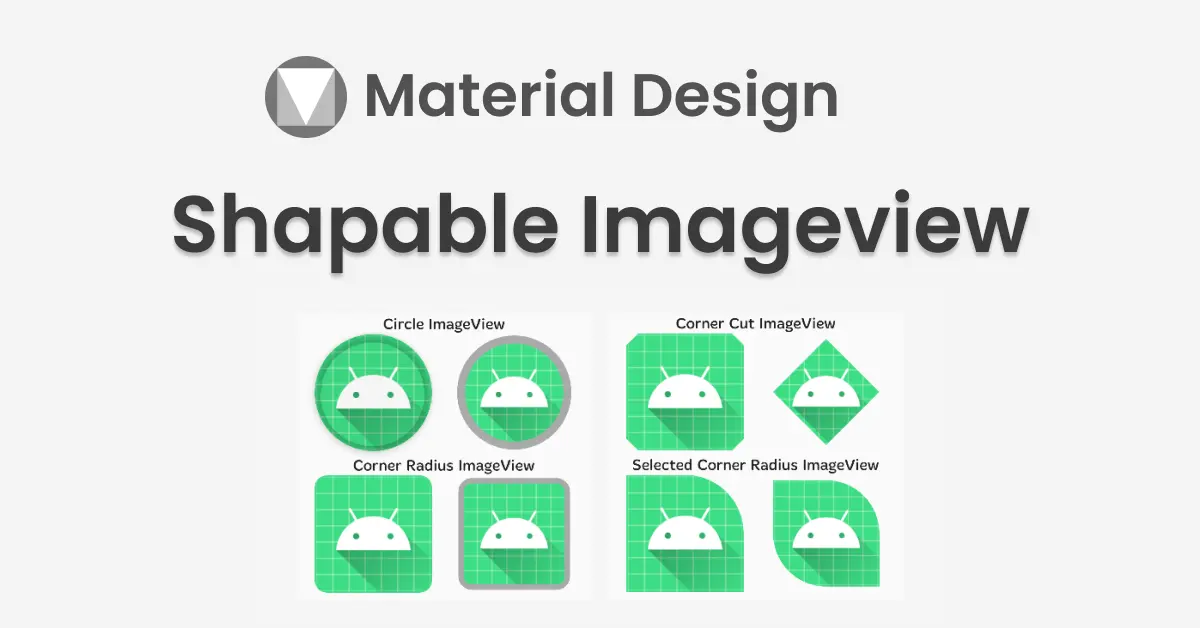
Do you want to change the shape of your ImageView in android? If yes then it’s the right place to look into it. Material Design 1.2.0 introduced ShapeableImageView which draws the image with the provided Shape in your imageview.
By using ShapeableImageView, you can change the shape of your image to a circle, diamond, etc. Also, you can set a corner radius to your imageview. You can do much more by using this ShapeableImageView with minimal code.
Check out the official ShapeableImageView Doc
before getting started, check out my other post on material design,
Progress Indicators – Material Components For Android
Android Chips – Material Component For Android
To work with ShapeableImageView in your android project, you need to add dependency material design 1.2.0 or higher.
implementation 'com.google.android.material:material:1.2.0'Important attributes of ShapeableImageView
app:shapeAppearanceOverlay — This is working as a ThemeOverlay. ShapeAppearanceOverlay applies the defined changes without affecting the active theme.
<style name="ShapeAppearanceOverlay.App.CornerSize50Percent" parent="">
            <item name="cornerSize">50%</item>
        </style>
The key to the overlay behavior is the empty parent attribute. This is what causes the overlay behavior. Let’s create an imageview in different shapes.
In the above style, cornerSize is only affected by the overlay. remaining properties are the same as the active theme.
cornerFamily — corner family to be used for all four corners
cornerFamilyTopLeft — corner family to be used for the top left corner
cornerFamilyTopRight — corner family to be used for the top right corner
cornerFamilyBottomRight — corner family to be used for the bottom right corner
cornerFamilyBottomLeft — corner family to be used for the bottom left corner
cornerFamily – is an enum type and the supported values are rounded and cut.
cornerSize — corner size to be used for all four corners
cornerSizeTopLeft — corner size to be used for the top left corner
cornerSizeTopRight — corner size to be used for the top right corner
cornerSizeBottomRight — corner size to be used for the bottom right corner
cornerSizeBottomLeft — corner size to be used for the bottom left corner
Imageview in circle shape
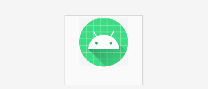
Using XML
as mentioned above, first we need to set the app:shapeAppearanceOverlay. In the overlay, we need to mention the corner radius size to 50% to make the imageview a circle.
<com.google.android.material.imageview.ShapeableImageView
            android:layout_width="150dp"
            android:layout_height="150dp"
            app:layout_constraintTop_toTopOf="parent"
            app:layout_constraintStart_toStartOf="parent"
            app:layout_constraintEnd_toEndOf="parent"
            app:srcCompat="@mipmap/ic_launcher"
            android:layout_margin="10dp"
            app:shapeAppearanceOverlay="@style/ShapeAppearanceOverlay.App.CornerSize50Percent"
            />
In your style.xml add,
<style name="ShapeAppearanceOverlay.App.CornerSize50Percent" parent="">
<item name="cornerSize">50%</item>
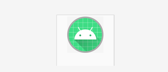
</style>If you want to add a stroke to a circle imageview, you can add stroke attributes in your ShapeableImageView.
<com.google.android.material.imageview.ShapeableImageView
            android:layout_width="250dp"
            android:layout_height="250dp"
            android:padding="5dp"
            app:strokeWidth="10dp"
            app:strokeColor="@android:color/darker_gray"    app:shapeAppearanceOverlay="@style/ShapeAppearanceOverlay.App.CornerSize50Percent"
            app:layout_constraintTop_toTopOf="parent"
            app:layout_constraintStart_toStartOf="parent"
            app:layout_constraintEnd_toEndOf="parent"
            app:srcCompat="@mipmap/ic_launcher"
            android:layout_margin="10dp"
            />
Dynamically using Kotlin
val radius = resources.getDimension(R.dimen.corner_radius)
            val shapeAppearanceModel = circleShapeImageView.shapeAppearanceModel.toBuilder()
                .setAllCornerSizes(radius)
                .build()
            circleShapeImageView.shapeAppearanceModel = shapeAppearanceModel
set the corner radius in dimens.xml
<dimen name="corner_radius">125dp</dimen>Corner Radius Imageview
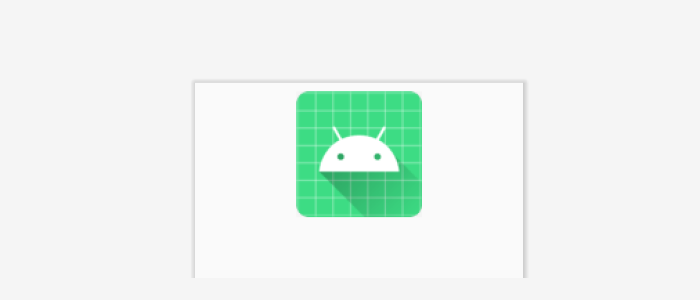
Using XML
we need to set the app:shapeAppearanceOverlay. In the overlay, we need to mention the corner radius size to 10% to set the corner radius.
 <com.google.android.material.imageview.ShapeableImageView
            android:layout_width="150dp"
            android:layout_height="150dp"
            app:layout_constraintTop_toTopOf="parent"
            app:layout_constraintStart_toStartOf="parent"
            app:layout_constraintEnd_toEndOf="parent"
            app:srcCompat="@mipmap/ic_launcher"
            android:layout_margin="10dp"
            app:shapeAppearanceOverlay="@style/ShapeAppearanceOverlay.App.CornerSize10Percent"
            />
In your style.xml add,
<style name="ShapeAppearanceOverlay.App.CornerSize10Percent" parent="">
            <item name="cornerSize">10%</item>
        </style>
same way, If you want to add a stroke to the corner radius imageview, you can add stroke attributes in your ShapeableImageView.
<com.google.android.material.imageview.ShapeableImageView
            android:layout_width="150dp"
            android:layout_height="150dp"
            app:layout_constraintTop_toTopOf="parent"
            app:layout_constraintStart_toStartOf="parent"
            app:layout_constraintEnd_toEndOf="parent"
            app:srcCompat="@mipmap/ic_launcher"
            android:layout_margin="10dp"
            app:strokeWidth="10dp"
            android:padding="5dp"
            app:strokeColor="@android:color/darker_gray"
            app:shapeAppearanceOverlay="@style/ShapeAppearanceOverlay.App.CornerSize10Percent"
            />
Dynamically using Kotlin
val radius = resources.getDimension(R.dimen.corner_radius)
            val shapeAppearanceModel = circleShapeImageView.shapeAppearanceModel.toBuilder()
                .setAllCornerSizes(radius)
                .build()
            circleShapeImageView.shapeAppearanceModel = shapeAppearanceModel
set the corner radius in dimens.xml
<dimen name="corner_radius">12dp</dimen>Corner cut imageview
Using XML
For the corner cut imageview, we are going to use cornerFamily.
by default, cornerFamily will be rounded. In our case, we need it to be cut. So we are changing cornerFamily to cut.
<com.google.android.material.imageview.ShapeableImageView
            android:id="@+id/imageViewCircleWithStroke"
            app:shapeAppearanceOverlay="@style/ShapeAppearanceOverlay.App.CornerCut"
            android:layout_width="150dp"
            android:layout_height="150dp"
            android:layout_marginTop="10dp"
            android:src="@mipmap/ic_launcher"
            app:layout_constraintTop_toTopOf="parent"
            app:layout_constraintEnd_toEndOf="parent"
            app:layout_constraintStart_toStartOf="parent"/>
in style.xml:
<style name="ShapeAppearanceOverlay.App.CornerCut" parent="">
            <item name="cornerSize">15dp</item>
            <item name="cornerFamily">cut</item>
        </style>
By changing, cornerSize we can make different shapes like diamonds, hexagons, etc.
Dynamically using Kotlin
val radius = resources.getDimension(R.dimen.corner_radius)
            val shapeAppearanceModel = shapeableImageView.shapeAppearanceModel.toBuilder()
                .setAllCorners(CornerFamily.CUT,radius)
                .build()
shapeableImageView.shapeAppearanceModel = shapeAppearanceModelsetAllCorners()used to set both cornerFamily and cornerRadius.
Selected Corner Radius / Cut imageview
Using XML
To set the corner radius for the selected position, we need to use both cornerSize and cornerFamily for the particular position.
For example, check the below example to set the corner radius for the right top position of the imageview.
in style.xml:
<style name="ShapeAppearanceOverlay.App.SelectedCornerRadius" parent="">
            <item name="cornerSizeTopRight">75dp</item>
            <item name="cornerFamilyTopRight">rounded</item>
        </style>
for the cut corner radius in style.xml:
<style name="ShapeAppearanceOverlay.App.SelectedCornerCut" parent="">
            <item name="cornerSizeTopRight">75dp</item>
            <item name="cornerFamilyTopRight">cut</item>
        </style>
same way for the multiple corners, we need to add cornerRadius and cornerFamily.
in style.xml:
<style name="ShapeAppearanceOverlay.App.SelectedCornerRadius" parent="">
            <item name="cornerSizeTopRight">75dp</item>
            <item name="cornerFamilyTopRight">rounded</item>
            <item name="cornerSizeBottomLeft">75dp</item>
            <item name="cornerFamilyBottomLeft">rounded</item>
        </style>

        <style name="ShapeAppearanceOverlay.App.SelectedCornerCut" parent="">
            <item name="cornerSizeTopRight">75dp</item>
            <item name="cornerFamilyTopRight">cut</item>
            <item name="cornerSizeBottomLeft">75dp</item>
            <item name="cornerFamilyBottomLeft">cut</item>
        </style>
Dynamically using Kotlin
val radius = resources.getDimension(R.dimen.corner_radius)
            val shapeAppearanceModel = shapeableImageView.shapeAppearanceModel.toBuilder()
                .setTopRightCorner(CornerFamily.ROUNDED,radius)
                .build()
            shapeableImageView.shapeAppearanceModel = shapeAppearanceModel
setTopRightCorner() used to set the corner radius for the top right corner. To set multiple corners we can use setBottomLeftCorner(), setTopLeftCorner() and setBottomRightCorner() .
That’s it. Thanks for reading. You can download the example from github.
Leave a Reply