Progress indicators express an unspecified wait time or display the length of a process. Material design provides an implementation of linear and circular progress indicators, compatible back to API 15.
Progress Indicators is API-compatible with Android’s progressBar class and can therefore be used as a replacement for the progressBar.
Progress Indicators were added to the material design in 1.3.0. Now it’s in alpha 02. So you need to include the following dependency to work with the progress indicator.
implementation 'com.google.android.material:material:1.3.0-alpha02'Before starting check out my other post on material design:
ShapeableImageView — Material Components For Android
Sliders – Material Component For Android
Usage of progress indicators
It can be included in XML layouts, or constructed programmatically:
XML
<com.google.android.material.progressindicator.ProgressIndicator
           android:id="@+id/progressCircleDeterminate"
           android:layout_width="match_parent"
           android:layout_height="wrap_content"
           android:layout_gravity="center"
           android:progress="70"
           style="@style/Widget.MaterialComponents.ProgressIndicator.Circular.Determinate"/>
Kotlin
//Create the progress indicator
            val progressIndicator = ProgressIndicator(
                this, null, 0,
                R.style.Widget_MaterialComponents_ProgressIndicator_Circular_Determinate)
            // add progress indicator into layout
            parentLayout.addView(progressIndicator, LinearLayout.LayoutParams(MATCH_PARENT, WRAP_CONTENT))
            // set the progress
            progressIndicator.progress = 40
            // display the progress dialog
            progressIndicator.show()
Showing and hiding progress indicators
use the show() method to show the indicator.
progress.show()use the hide() method to hide the indicator.
progress.hide()Animation on progress indicators
GrowMode will have different visual effects on the linear and circular progress indicators.
Types of progress indicators
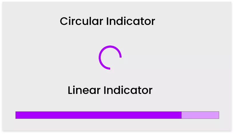
Material Design offers two visually distinct types of progress indicators:
Linear indicator
Circular indicator
Let us see both progress indicators in detail.
Determinate Linear progress Indicator
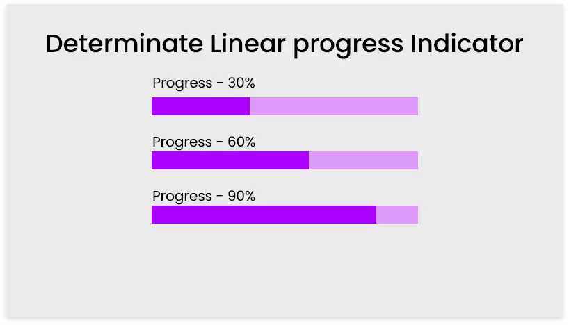
operations display the indicator increasing in width from 0 to 100% of the track, in sync with the process’s progress.
The important part is adding style to the progress indicator.
For determinate linear progress, we need to add,
style="@style/Widget.MaterialComponents.ProgressIndicator.Linear.Determinate"/>style to create programmatically:
R.style.Widget_MaterialComponents_ProgressIndicator_Linear_DeterminateAlso, we need to set the progress attribute based on the process level.
android:progress=”70″ or progressIndicator.progress = 70.
Adding Determinate Linear progress Indicator using XML,
<com.google.android.material.progressindicator.ProgressIndicator
           android:id="@+id/progressLinearDeterminate"
           android:layout_width="match_parent"
           android:layout_height="wrap_content"
           android:layout_gravity="center"
           android:progress="70"
        style="@style/Widget.MaterialComponents.ProgressIndicator.Linear.Determinate"/>
Programatically using kotlin,
val progressIndicator = ProgressIndicator(
this, null, 0,
R.style.Widget_MaterialComponents_ProgressIndicator_Linear_Determinate)
// add progress indicator into layout
parentLayout.addView(progressIndicator, LinearLayout.LayoutParams(MATCH_PARENT, WRAP_CONTENT))
// set the progress
progressIndicator.progress = 70
// display the progress dialog
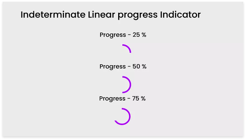
progressIndicator.show()Indeterminate Linear Progress Indicator
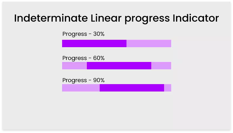
Indeterminate progress indicators move along a fixed track, growing and shrinking in size.
Adding style for the progress indicator.
For indeterminate linear progress, we need to add,
style="@style/Widget.MaterialComponents.ProgressIndicator.Linear.Indeterminate"/>style to create programmatically:
R.style.Widget_MaterialComponents_ProgressIndicator_Linear_IndeterminateAdding Indeterminate Linear progress Indicator using XML,
<com.google.android.material.progressindicator.ProgressIndicator
           android:id="@+id/progressCircleDeterminate"
           android:layout_width="match_parent"
           android:layout_height="wrap_content"
           android:layout_gravity="center"
           android:progress="70"
        style="@style/Widget.MaterialComponents.ProgressIndicator.Linear.Indeterminate"/>
Programatically using kotlin,
val progressIndicator = ProgressIndicator(
                this, null, 0,
                R.style.Widget_MaterialComponents_ProgressIndicator_Linear_Indeterminate)
            // add progress indicator into layout
            parentLayout.addView(progressIndicator, LinearLayout.LayoutParams(MATCH_PARENT, WRAP_CONTENT))
            // set the progress
            progressIndicator.progress = 70
            // display the progress dialog
            progressIndicator.show()
Circular indicator
Circular progress indicators display progress by animating an indicator along an invisible circular track in a clockwise direction. They can be applied directly to a surface, such as a button or a card.
Types
Circle progress indicators support both determinate and indeterminate operations.
Determinate
Indeterminate
Determinate Circle progress Indicator
operations display the indicator increasing in width from 0 to 100% of the circle.
The important part is adding style to the progress indicator.
For determinate circle progress we need to add,
style="@style/Widget.MaterialComponents.ProgressIndicator.Circle.Determinate"/>a style to create programmatically:
R.style.Widget_MaterialComponents_ProgressIndicator_Circle_DeterminateAlso, we need to set the progress attribute based on the process level.
android:progress=”70″ or progressIndicator.progress = 70.
Adding Determinate circle progress Indicator using XML,
<com.google.android.material.progressindicator.ProgressIndicator
           android:id="@+id/progressCircleDeterminate"
           android:layout_width="match_parent"
           android:layout_height="wrap_content"
           android:layout_gravity="center"
           android:progress="70"
        style="@style/Widget.MaterialComponents.ProgressIndicator.Circle.Determinate"/>
Programatically using kotlin,
val progressIndicator = ProgressIndicator(
this, null, 0,
R.style.Widget_MaterialComponents_ProgressIndicator_Circle_Determinate)
// add progress indicator into layout
parentLayout.addView(progressIndicator, LinearLayout.LayoutParams(MATCH_PARENT, WRAP_CONTENT))
// set the progress
progressIndicator.progress = 70
// display the progress dialog
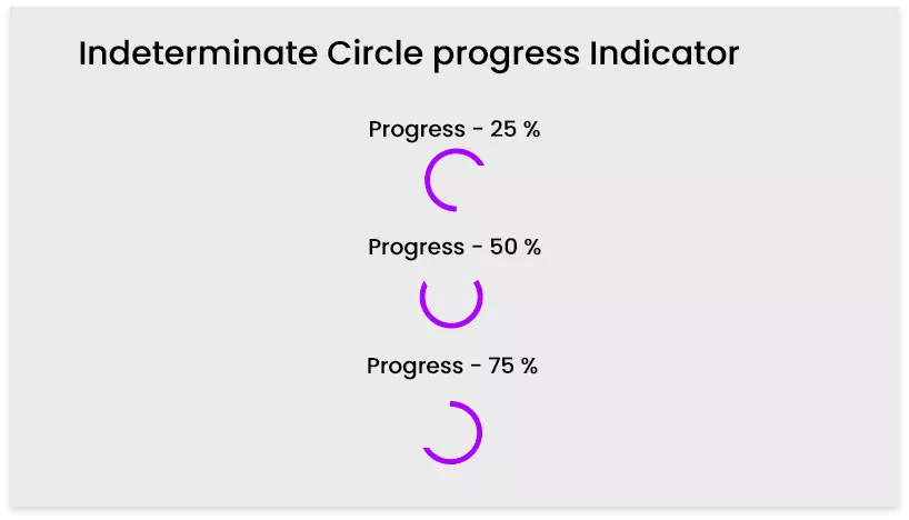
progressIndicator.show()Indeterminate Circle Progress Indicator
Indeterminate progress indicators move along a fixed track, growing and shrinking in size in a circle shape.
The important part is adding style to the progress indicator.
For indeterminate circle progress we need to add,
style="@style/Widget.MaterialComponents.ProgressIndicator.Circle.Indeterminate"/>style to create programmatically:
R.style.Widget_MaterialComponents_ProgressIndicator_Circle_IndeterminateAlso, we need to set the progress attribute based on the process level.
android:progress=”70″ or progressIndicator.progress = 70.
Adding Indeterminate circle progress Indicator using XML,
<com.google.android.material.progressindicator.ProgressIndicator
           android:id="@+id/progressCircleIndeterminate"
           android:layout_width="match_parent"
           android:layout_height="wrap_content"
           android:layout_gravity="center"
           android:progress="70"
        style="@style/Widget.MaterialComponents.ProgressIndicator.Circle.Indeterminate"/>
Programatically using kotlin,
val progressIndicator = ProgressIndicator(
                this, null, 0,
                R.style.Widget_MaterialComponents_ProgressIndicator_Circle_Indeterminate)
            // add progress indicator into layout
            parentLayout.addView(progressIndicator, LinearLayout.LayoutParams(MATCH_PARENT, WRAP_CONTENT))
            // set the progress
            progressIndicator.progress = 70
            // display the progress dialog
            progressIndicator.show()
theming Progress Indicators
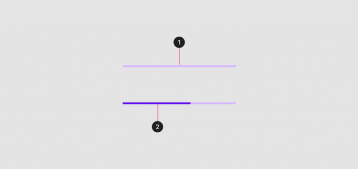
Linear progress indicators are composed of two required elements:
1. Track – The track is a fixed-width rule, with set boundaries for the indicator to travel along.
2. Indicator – The indicator animates along the length of the track.
trackColor — Used to set the color for the circle / linear progress track.
app:trackColor="@color/colorAccent"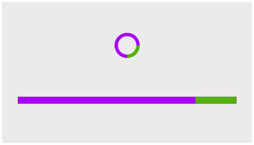
indicatorColor — Used to set the color for the circle / linear progress indicator.
app:indicatorColor="@color/colorPrimary"indicatorWidth — Used to change the indicator width for both linear / circle indicators.
app:indicatorWidth="20dp"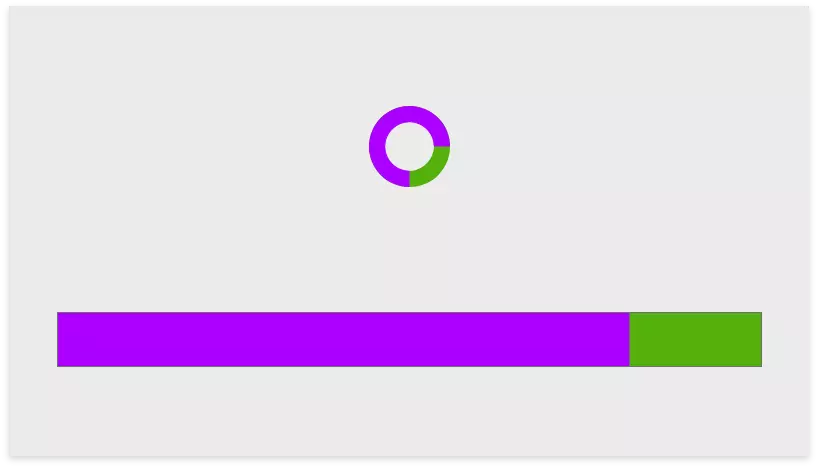
That’s it.
Thanks for reading.
Please provide your feedback in the comments. Also, share if you like it.
You can download this example in GITHUB.
Leave a Reply