Jetpack Compose implements Material Theming and supports a dark theme by default. You can customize color, typography, and shape theming values to fit your product’s brand, and get access to convenient functions for working with a system of dark themes (like isSystemInDarkTheme, lightColors, and darkColors).
The default MaterialTheme from the documentation looks like this:
MaterialTheme(
        colors = colors,
        typography = Typography,
        shapes = Shapes,
        content = content
    )
We can set custom attributes:
- colors: A complete definition of the Material Color theme for this hierarchy.
- typography: A set of text styles to be used as this hierarchy’s typography system.
- shapes: A set of shapes to be used by the components in this hierarchy.
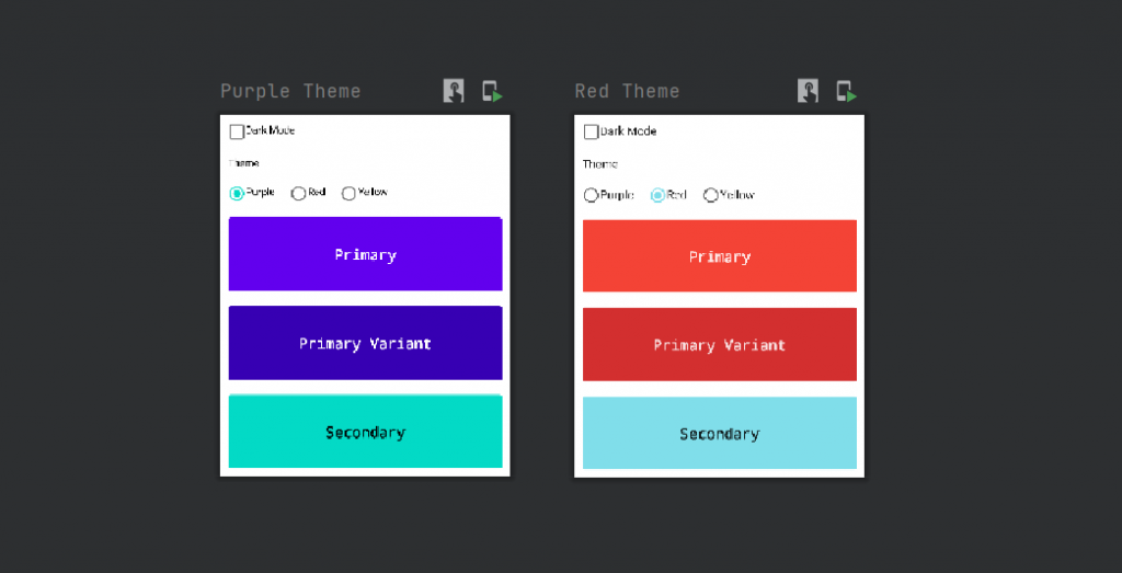
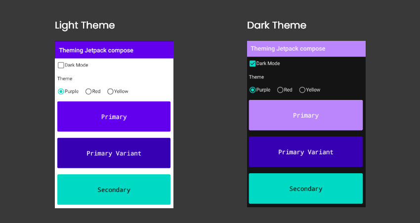
Check out the example I have created for jetpack compose material theming:
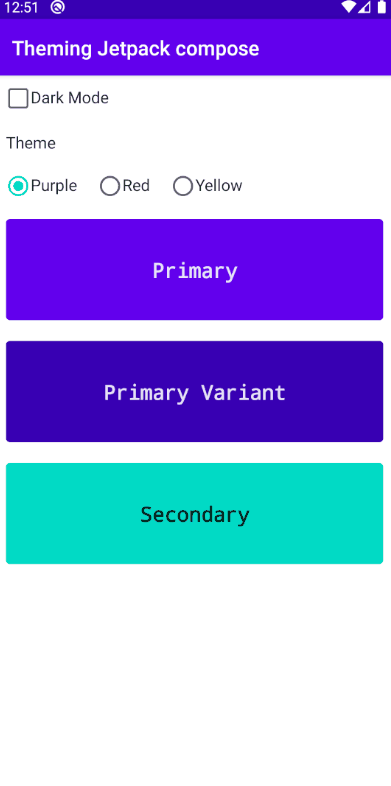
you can download this example from github.
If you’re new to Compose, I highly recommend going through the following articles:
Getting started with jetpack compose – Basic components
Getting started with jetpack compose – Layouts
Getting started with jetpack compose – Modifiers
Getting started with jetpack compose – ConstraintLayout
Getting started with jetpack compose – Scaffold layout
Let’s see the material theme attributes in detail.
Color
Jetpack Compose uses the Color class from Compose’s graphics package. We have many ways to define a color, but there are two common ways we use it more frequently.
One Way is defining the hex code of the color
val Purple200 = Color(0xFFBB86FC)
The other way is specifying the RGB values to the Color class:
val blue = Color(red = 0f, green = 0f, blue = 1f)
Since ARGB Hex is just a bunch of jargon to describe what the heck “0XFF00bc00” means, let me translate:
- First two characters
0xtell the compiler that this is a hexadecimal number - The second two characters, “
FF” or “DC“, represent Transparency/Opaqueness/Alpha in Hex - The remaining six character pairs represent Red, Green, and Blue
Create a file called something like Color.kt (the name does not matter) and fill it with immutable values:
Color.kt
import androidx.compose.ui.graphics.Color

    val Purple200 = Color(0xFFBB86FC)
    val Purple500 = Color(0xFF6200EE)
    val Purple700 = Color(0xFF3700B3)
    val Teal200 = Color(0xFF03DAC5)
Accessing the Color from the **color.kt** when required.
Text(text = "Jetpack compose" , color = Purple500)Colors class
The colors class allows us to define different Material Design Color Systems.
class Colors(
        primary: Color,
        primaryVariant: Color,
        secondary: Color,
        secondaryVariant: Color,
        background: Color,
        surface: Color,
        error: Color,
        onPrimary: Color,
        onSecondary: Color,
        onBackground: Color,
        onSurface: Color,
        onError: Color,
        isLight: Boolean
    )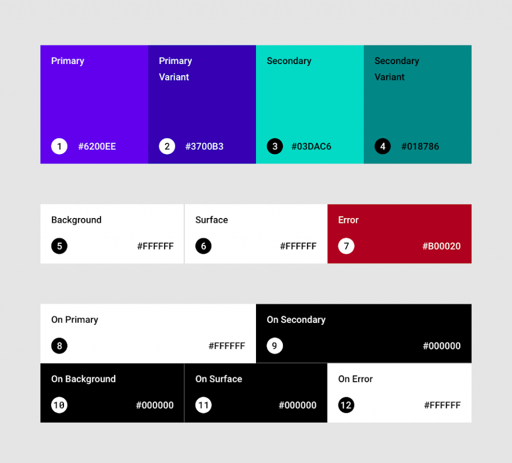
There are around 13 attributes in the constructor of Colors. Let’s see what each attribute means.
- Primary – color displayed most frequently across your app’s screens and components;
- Primary Variant – color is used to distinguish elements using primary colors, such as the top app bar and the system bar.
- Secondary – color provides more ways to accent and distinguishes your product. Having a secondary color is optional, and should be applied sparingly to accent select parts of your UI;
- SecondaryVariant– color is used to distinguish elements using secondary colors;
- Background – color appears behind scrollable content;
- Surface – color uses on surfaces of components, like cards and menus;
- Error – color used for indicating an error.
- OnPrimary – the color of text and icons displayed on top of the primary color.
*OnSecondary– the color of text and icons displayed on top of the secondary color; - OnBackground – the color of text and icons displayed on top of the background color;
- OnSurface – the color of text and icons displayed on top of the surface color;
- OnError – the color of text and icons displayed on top of the error color.
- IsLight – Whether these colors are considered as a “light” or “dark” set of colors.
To make our support for DarkMode and LightMode easier, Jetpack Compose also provides two functions that generate default colors for these modes.
darkColorslightColors
private val DarkColorPalette = darkColors(
    primary = Purple200,
    primaryVariant = Purple700,
    secondary = Teal200,
    onPrimary = Color.White,
    onSecondary = Color.Black
)

private val LightColorPalette = lightColors(
            primary = Purple500,
            primaryVariant = Purple700,
            secondary = Teal200,
            onPrimary = Color.White,
            onSecondary = Color.Black
)
We have successfully created colors for the Material Theme. Let’s create the Typography.
Typography
The Typograph is a class that helps us to style texts. With the help of the Typograph class, we can customize FontFamily, FontStyle, FontWeight, LetterSpacing, TextDecoration, Color, and many more attributes related to texts.
class Typography(
        defaultFontFamily: FontFamily = FontFamily.Default,
        h1: TextStyle,
        h2: TextStyle,
        h3: TextStyle,
        h4: TextStyle,
        h5: TextStyle,
        h6: TextStyle,
        subtitle1: TextStyle,
        subtitle2: TextStyle,
        body1: TextStyle,
        body2: TextStyle,
        button: TextStyle,
        caption: TextStyle,
        overline: TextStyle
    )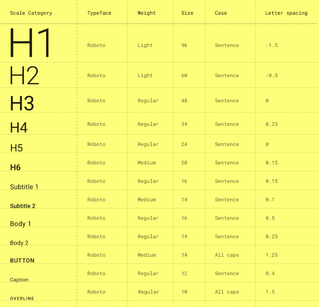
In addition to this, we should configure a Typography object with the following parameters:
- h1 is the largest headline, reserved for short and important text.
- h2 is the second-largest headline, reserved for short and important text.
- h3 is the third-largest headline, reserved for short and important text.
- h4 is the fourth-largest headline, reserved for short and important text.
- h5 is the fifth-largest headline, reserved for short and important text.
- h6 is the sixth-largest headline, reserved for short and important text.
- subtitle1 is the largest subtitle and is typically reserved for medium-emphasis text that is shorter in length.
- subtitle2 is the smallest subtitle and is typically reserved for medium-emphasis text that is shorter in length.
- body1 is the largest body and is typically reserved for a long-form text that is shorter in length.
- body2 is the smallest body and is typically reserved for a long-form text that is shorter in length.
- the button is reserved for a button text.
- the caption is one of the smallest font sizes it is reserved for annotating imagery or introducing a headline.
- overline is one of the smallest font sizes.
We can override the needed font Style like h1, body1, button, etc as below,
Type.kt
val Typography = Typography(
        body1 = TextStyle(
            fontFamily = FontFamily.Default,
            fontWeight = FontWeight.Normal,
            fontSize = 16.sp
        ),
        button = TextStyle(
            fontFamily = FontFamily.Default,
            fontWeight = FontWeight.W500,
            fontSize = 14.sp
        ),
        caption = TextStyle(
            fontFamily = FontFamily.Default,
            fontWeight = FontWeight.Normal,
            fontSize = 12.sp
        )

    )
The example I have created,
@Composable
fun TypographyPreview() {
    Column(Modifier.width(400.dp).padding(10.dp)) {
        Text(
            text = "H2 ",
            style = MaterialTheme.typography.h2
        ) Spacer (modifier = Modifier.padding(4.dp)) Text (text =
            "Subtitle 1 " , style = MaterialTheme.typography.subtitle1)
        Spacer(modifier = Modifier.padding(4.dp))
        Text(text = "Body 1 ", style = MaterialTheme.typography.body1)
        Spacer(modifier = Modifier.padding(4.dp))
        Text(text = "Button ", style = MaterialTheme.typography.button)
        Spacer(modifier = Modifier.padding(4.dp))
        Text(text = "Caption ", style = MaterialTheme.typography.caption)
    }
}
Done with the Typography. finally, create the shape.
Shape
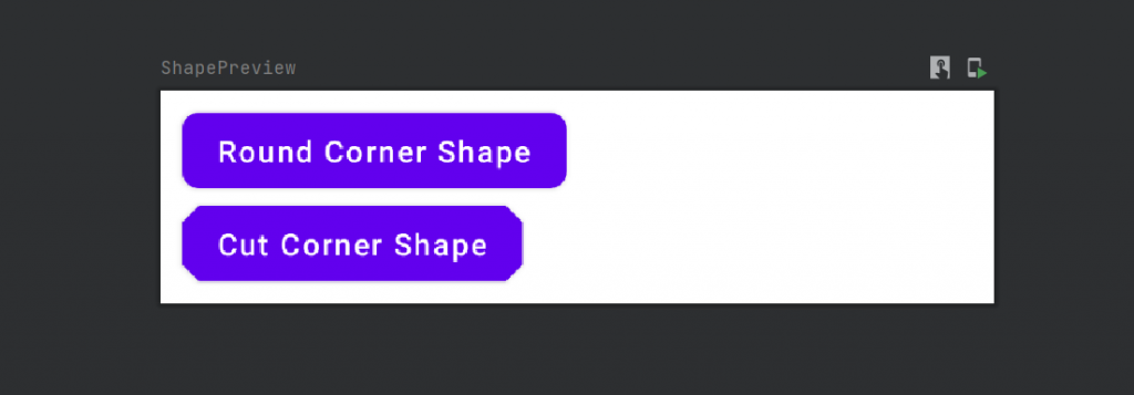
Creating shapes with Jetpack Compose is super easy. Similar to how we created the Typography instance, we also create the instance of Shapes.
Shape.kt
import androidx.compose.foundation.shape.RoundedCornerShape
    import androidx.compose.material.Shapes
    import androidx.compose.ui.unit.dp

    val Shapes = Shapes(
        small = RoundedCornerShape(4.dp),
        medium = RoundedCornerShape(4.dp),
        large = RoundedCornerShape(0.dp)
    )
Let’s Create a Material Theme
By using the instances of colors, typography, and shapes above, we can make a material theme that can be used across the application.
@Composable
fun JetpackComposeThemingTheme(colors: Colors,
                               content: @Composable() () -> Unit) {
    MaterialTheme(colors = colors,
        typography = Typography,
        shapes = Shapes,
        content = content)
}
CustomComposeTheme is a composable function with two attributes:
isDarkTheme — To set the dark or light color scheme based on checking isSystemInDarkTheme.
content — A composable function where the MaterialTheme is to be used.
class MainActivity : ComponentActivity() {
    override fun onCreate(savedInstanceState: Bundle?) {
        super.onCreate(savedInstanceState)
        setContent {
            MaterialTheme {
                Column {
                    Text(text = "Jetpack Compose")
                }
            }
        }
    }
}
Dark theme
Material composable that makes use of a Surface (like Card, TopAppBar, etc.) automatically includes dark theme properties like desaturated colors for accessibility, elevation overlays, and limited color accents. You can also incorporate these in custom scenarios.
isSystemInDarkTheme() is a call that asks any compatible Android device for the user’s preference for a light or dark theme.
It returns a boolean value which we can use in a Ternary (Conditional) Assignment expression such as
colors = if (darkTheme) DarkColorPalette else LightColorPalettecode to add the dark mode in the theme,
@Composable
fun PurpleTheme(darkTheme: Boolean = isSystemInDarkTheme(),
                content: @Composable() () -> Unit) {
    val colors = if (darkTheme) DarkColorPalette else LightColorPalette
    MaterialTheme (colors =
        colors, typography = Typography, shapes = Shapes, content = content)
}
Material Icons
Jetpack Compose also provides a convenient means of using icons listed in the Material Icons tool, including all icon styles—filled, outlined, rounded, two-tone, and sharp. With this artifact, you can use icons directly, without the need to download SVGs and convert them to VectorDrawables in Android Studio.
Add dependency in the module build.gradle
implementation "androidx.compose.material:material-icons-extended:$compose_version"You can get the icon by,
Icon(Icons.Default.Add) // Default == Filled
    Icon(Icons.Outlined.Notifications)
    Icon(Icons.Rounded.ArrowForward)
    Icon(Icons.TwoTone.Menu)
    Icon(
       Icons.Sharp.Edit,
       tint = MaterialTheme.colors.primary
    )
That’s all about jetpack compose theming.
You can download this example from Github.
Leave a Reply