
The Jetpack Compose implementation of the layout system has two main goals: being high-performant, and making it easy to write custom layouts. High performance is achieved in Compose by prohibiting measuring layout children more than once.
A Composable function might emit several UI elements. However, if you don’t provide guidance on how they should be arranged, Compose might arrange the elements in a way you don’t like.
If you’re new to Compose, I highly recommend going through the following articles:
Getting started with jetpack compose – Basic components
Getting started with jetpack compose – ConstraintLayout
Getting started with jetpack compose – Modifiers
Getting started with jetpack compose – Scaffold layout
Getting started with jetpack compose – Theming
Composable function without layout
@Composable
    fun DisplayTitle() {
        Text(text = "Title Welcome", fontSize = 30.sp)
        Text(text = "Jetpack compose")
    }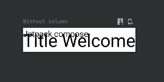
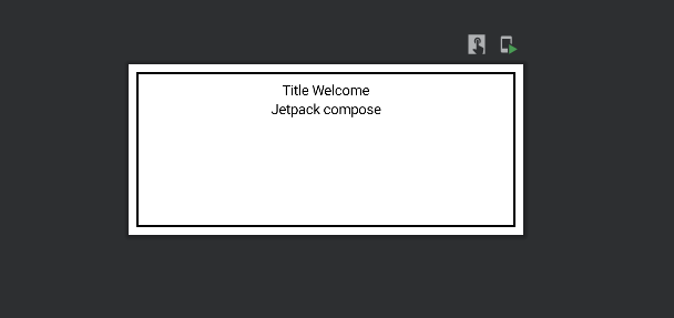
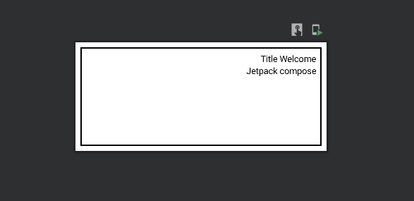
Without guidance on how you want them arranged, Compose stacks the text elements on top of each other, making them unreadable.
Standard layout components in jetpack
- Column
- Row
- Box
- Contraint Layout
- Scaffold
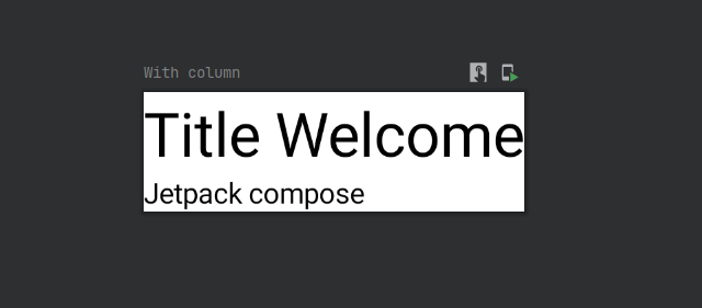
Column
The Column Composable provides us with the functionality of displaying a collection of composable in a vertically sequenced format, where each composable is displayed simultaneously one after the other.
Their counterpart in the XML world would be the LinearLayout (vertical and horizontal orientations).
Declaring a Column
@Composable
    inline fun Column(
        modifier: Modifier = Modifier,
        verticalArrangement: Arrangement.Vertical = Arrangement.Top,
        horizontalAlignment: Alignment.Horizontal = Alignment.Start,
        content: ColumnScope.() -> Unit
    )
There are four arguments which the constructor can take,
- modifier
- verticalArrangement
- horizontalAlignment
- children
Modifiers
The modifier is an ordered, immutable collection of modifier elements that decorate or add behavior to Compose UI elements. For example, backgrounds, padding, and click event listeners decorate or add behavior to rows, text, or buttons.
I will explain more about the modifiers in another post.
Getting started with jetpack compose – Modifiers
Vertical Arrangement
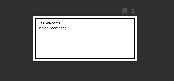
Using the verticalArrangement, we can arrange the child of the layout in the vertical axis. by default, they are laid out to be arranged at the top of the column.
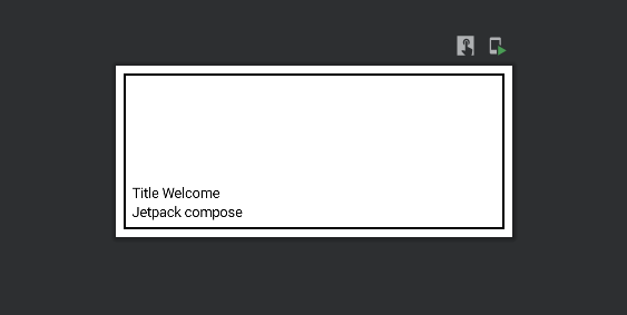
Top – align children to the top of the column
@Composable
    fun DisplayTitle() {
        Column(verticalArrangement = Arrangement.Top, modifier = Modifier.fillMaxWidth()
            .height(170.dp)
            .padding(8.dp)
            .border(2.dp, Color.Black)
            .padding(8.dp)) {
            Text(text = "Title Welcome")
            Text(text = "Jetpack compose")
        }
    }
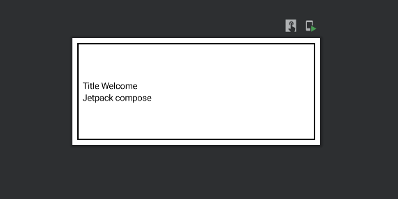
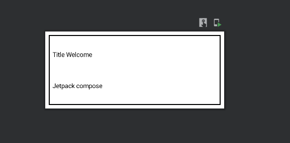
Center – align children at the center of the column
@Composable
    fun DisplayTitle() {
        Column(verticalArrangement = Arrangement.Center, modifier = Modifier.fillMaxWidth()
            .height(170.dp)
            .padding(8.dp)
            .border(2.dp, Color.Black)
            .padding(8.dp)) {
            Text(text = "Title Welcome")
            Text(text = "Jetpack compose")
        }
    }
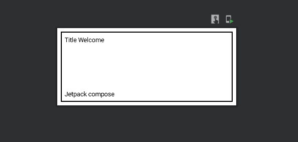
Bottom – align children to the bottom of the column
@Composable
    fun DisplayTitle() {
        Column(verticalArrangement = Arrangement.Bottom, modifier = Modifier.fillMaxWidth()
            .height(170.dp)
            .padding(8.dp)
            .border(2.dp, Color.Black)
            .padding(8.dp)) {
            Text(text = "Title Welcome")
            Text(text = "Jetpack compose")
        }
    }
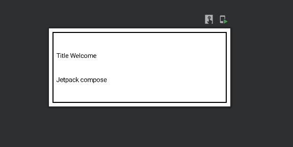
Space Around – evenly distribute the children within the column. As well as adding space before the first child and after the last child, half of that spacing will also be added between each consecutive child.
@Composable
    fun DisplayTitle() {
        Column(verticalArrangement = Arrangement.SpaceAround, modifier = Modifier.fillMaxWidth()
            .height(170.dp)
            .padding(8.dp)
            .border(2.dp, Color.Black)
            .padding(8.dp)) {
            Text(text = "Title Welcome")
            Text(text = "Jetpack compose")
        }
    }
Space Between – evenly distribute the children within the column, without adding space before the first child or after the last child
@Composable
    fun DisplayTitle() {
        Column(verticalArrangement = Arrangement.SpaceBetween, modifier = Modifier.fillMaxWidth()
            .height(170.dp)
            .padding(8.dp)
            .border(2.dp, Color.Black)
            .padding(8.dp)) {
            Text(text = "Title Welcome")
            Text(text = "Jetpack compose")
        }
    }
Space Evenly – evenly distribute the children within the column, also adding space before the first child and after the last child
@Composable
    fun DisplayTitle() {
        Column(verticalArrangement = Arrangement.SpaceEvenly, modifier = Modifier.fillMaxWidth()
            .height(170.dp)
            .padding(8.dp)
            .border(2.dp, Color.Black)
            .padding(8.dp)) {
            Text(text = "Title Welcome")
            Text(text = "Jetpack compose")
        }
    }
horizontal alignment
this allows us to position all of the Column children on the horizontal axis.
The horizontalAlignment parameter can be assigned one of three values:
Start – align the children to the start of the horizontal axis
@Composable
    fun DisplayTitle() {
        Column(horizontalAlignment = Alignment.Start, modifier = Modifier.fillMaxWidth()
            .height(170.dp)
            .padding(8.dp)
            .border(2.dp, Color.Black)
            .padding(8.dp)) {
            Text(text = "Title Welcome")
            Text(text = "Jetpack compose")
        }
    }
CenterHorizontally – align the children at the center of the horizontal axis
@Composable
    fun DisplayTitle() {
        Column(horizontalAlignment = Alignment.CenterHorizontally, modifier = Modifier.fillMaxWidth()
            .height(170.dp)
            .padding(8.dp)
            .border(2.dp, Color.Black)
            .padding(8.dp)) {
            Text(text = "Title Welcome")
            Text(text = "Jetpack compose")
        }
    }
End – align the children at the end of the horizontal axis
@Composable
    fun DisplayTitle() {
        Column(horizontalAlignment = Alignment.End, modifier = Modifier.fillMaxWidth()
            .height(170.dp)
            .padding(8.dp)
            .border(2.dp, Color.Black)
            .padding(8.dp)) {
            Text(text = "Title Welcome")
            Text(text = "Jetpack compose")
        }
    }
Children
We can declare a collection of any composable for the children’s argument.
@Composable
    fun DisplayTitle() {
        Column {
            Text(text = "Title Welcome")
            Text(text = "Jetpack compose")
        }
    }
In this case, Text() is the children’s of the column. We can add multiple children to the column layout.
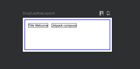
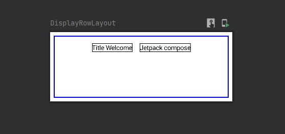
Row
A Row will show each child next to the previous children. It’s similar to a LinearLayout with a horizontal orientation.
@Composable
    inline fun Row(
        modifier: Modifier = Modifier,
        horizontalArrangement: Arrangement.Horizontal = Arrangement.Start,
        : Alignment.Vertical = Alignment.Top,
        content: RowScope.() -> Unit
    ): @Composable Unit
Using Row,
@Composable
    fun DisplayRowLayout() {
        Row(Modifier.fillMaxWidth()
            .height(150.dp)
            .padding(8.dp).border(2.dp, Color.Blue).padding(8.dp)) {
            Text(text = "Title Welcome", Modifier.padding(8.dp).border(1.dp, Color.Black))
            Text(text = "Jetpack compose", Modifier.padding(8.dp).border(1.dp, Color.Black))
        }
    }
Row takes the four parameters.
- modifier
- horizontalArrangement
- verticalAlignment
- children
horizontalArrangement
It’s the same as the column’s vericalArrangement, but the direction will be in the vertical axis.
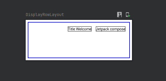
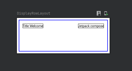
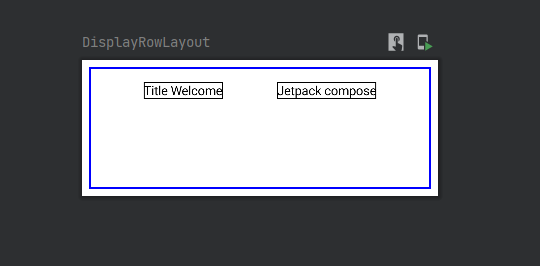
Start– align children to the start of the row
it’s the default arrangement. Please check the above code for the example.
Center – align children at the center of the row
@Composable
    fun DisplayRowLayout() {
        Row(Modifier.fillMaxWidth()
            .height(150.dp)
            .padding(8.dp).border(2.dp, Color.Blue).padding(8.dp), horizontalArrangement = Arrangement.Center) {
            Text(text = "Title Welcome", Modifier.padding(8.dp).border(1.dp, Color.Black))
            Text(text = "Jetpack compose", Modifier.padding(8.dp).border(1.dp, Color.Black))
        }
    }
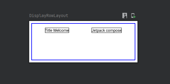
End – align the children at the end of the row
@Composable
    fun DisplayRowLayout() {
        Row(Modifier.fillMaxWidth()
            .height(150.dp)
            .padding(8.dp).border(2.dp, Color.Blue).padding(8.dp), horizontalArrangement = Arrangement.End) {
            Text(text = "Title Welcome", Modifier.padding(8.dp).border(1.dp, Color.Black))
            Text(text = "Jetpack compose", Modifier.padding(8.dp).border(1.dp, Color.Black))
        }
    }
Space Around – evenly distribute the children within the row. As well as adding space before the first child and after the last child, half of that spacing will also be added between each consecutive child.
@Composable
    fun DisplayRowLayout() {
        Row(Modifier.fillMaxWidth()
            .height(150.dp)
            .padding(8.dp).border(2.dp, Color.Blue).padding(8.dp), horizontalArrangement = Arrangement.SpaceAround) {
            Text(text = "Title Welcome", Modifier.padding(8.dp).border(1.dp, Color.Black))
            Text(text = "Jetpack compose", Modifier.padding(8.dp).border(1.dp, Color.Black))
        }
    }
Space Between – evenly distribute the children within the row, without adding space before the first child or after the last child.
@Composable
    fun DisplayRowLayout() {
        Row(Modifier.fillMaxWidth()
            .height(150.dp)
            .padding(8.dp).border(2.dp, Color.Blue).padding(8.dp), horizontalArrangement = Arrangement.SpaceBetween) {
            Text(text = "Title Welcome", Modifier.padding(8.dp).border(1.dp, Color.Black))
            Text(text = "Jetpack compose", Modifier.padding(8.dp).border(1.dp, Color.Black))
        }
    }
Space Evenly – evenly distribute the children within the row, also adding space before the first child and after the last child.
@Composable
    fun DisplayRowLayout() {
        Row(Modifier.fillMaxWidth()
            .height(150.dp)
            .padding(8.dp).border(2.dp, Color.Blue).padding(8.dp), horizontalArrangement = Arrangement.SpaceEvenly) {
            Text(text = "Title Welcome", Modifier.padding(8.dp).border(1.dp, Color.Black))
            Text(text = "Jetpack compose", Modifier.padding(8.dp).border(1.dp, Color.Black))
        }
    }
vertical Alignment
Allows us to position all of the row children on the vertical axis.
The vertical Alignment parameter can be assigned one of three values.
Top – Align the top of the row. It’s default alignment.
CenterVertically – Align the vertically center of the row.
Bottom – Align the vertically bottom of the row.
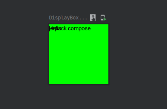
Box
The children of the Box layout will be stacked over each other. You can use the align modifier to specify where the composable should be drawn.
@Composable
    fun DisplayBoxLayout() {
        Box(modifier = Modifier
            .size(150.dp,150.dp)
            .background(Color.Green)) {
            Text(text = "Hello")
            Text(text = "jetpack compose")
        }
    }
If you run this code, you can clearly see that the view are stacked one after another.
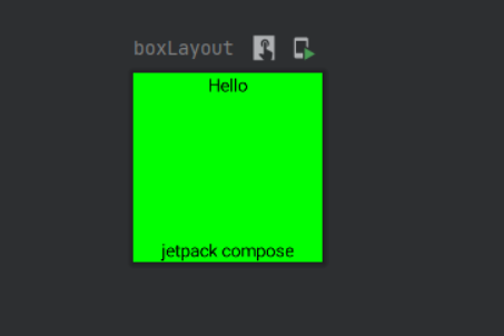
We can use Alignments to place child elements in different positions of the parent box layout.
@Composable
    fun boxLayout() {
        Box(modifier = Modifier
            .size(150.dp,150.dp)
            .background(Color.Green)) {
            Text(text = "Hello", modifier = Modifier.align(Alignment.TopCenter))
            Text(text = "jetpack compose", modifier = Modifier.align(Alignment.BottomCenter))
        }
    }
In the above code, I have added TopCenter alignment for the Hello text and BottomCenter alignment for the jetpack compose text. this is how we need to change the alignment of the views inside the box layout.
Child elements of a box layout can have 9 different alignments.
- Alignment.TopStart
- Alignment.TopCenter
- Alignment.TopEnd
- Alignment.CenterStart
- Alignment.Center
- Alignment.CenterEnd
- Alignment.BottomStart
- Alignment.BottomCenter
- Alignment.BottomEnd
Constraint Layout
ConstraintLayout can help place composable relative to others on the screen and is an alternative to using multiple nested Row, Column, Box, and custom layout elements. ConstraintLayout is useful when implementing larger layouts with more complicated alignment requirements.
Check the below link to learn constraint Layout in jetpack compose
Getting started with jetpack compose – ConstraintLayout
Scaffold
A Scaffold is a layout that implements the basic material design layout structure. You can add things like a TopBar, BottomBar, FAB, or a Drawer.
I have explained the scaffold layout in another post.
Getting started with jetpack compose – Scaffold layout
That’s it. Thanks for reading.
You can download this example on Github.
Leave a Reply