
In this tutorial, we are going to learn about how to create an image slider with a dot indicator in jetpack compose. When we are working with XML to create an image slider we will use Viewpager.
But in jetpack compose we don’t have a viewpager for now. But, we have an Accompanist-Pager layout to do the same on jetpack compose.
let’s get detail in the Accompanist- Pager layouts.
Accompanist – Pager layouts
A library that provides paging layouts for Jetpack Compose. If you’ve used Android’s ViewPager before, it has similar properties.
Official Documentation – Guide – Accompanist (google.github.io)
The pager layouts are currently experimental and the APIs could change at any time. All of the APIs are marked with the
@ExperimentalPagerApiannotation.
In our case, we are going to use HorizontalPager from the Accompanist pager library for the image slider effect.
HorizontalPager is a layout that lays out items in a horizontal row and allows the user to horizontally swipe between pages.
let’s get into the image slider example,
Image Slider With Dot Indicator Example
First, we need to add the Accompanist – Pager dependency in your build.gradle file.
implementation "com.google.accompanist:accompanist-pager:0.22.0-rc"Also, in this project, we are going to use retrofit and coil to fetch the list of movies using API and display it.
implementation "io.coil-kt:coil-compose:1.4.0"
    // retrofit
    implementation 'com.squareup.retrofit2:retrofit:2.9.0'
    implementation "com.squareup.okhttp3:okhttp:5.0.0-alpha.2"
    implementation 'com.squareup.retrofit2:converter-gson:2.9.0'
    implementation("com.squareup.okhttp3:logging-interceptor:4.9.3")
Setup Image Data
Already, I have explained the retrofit and coil in another tutorial. Please check the below link for the details.
Jetpack compose – Retrofit with Recyclerview – Howtodoandroid
For this example, I am going to use https://www.howtodoandroid.com/apis/movielist.json API to fetch the list of movies. The API response will be,
[{
            "category": "Latest",
            "imageUrl": "https://www.howtodoandroid.com/images/coco.jpg",
            "name": "Coco",
            "desc": "Coco is a 2017 American 3D computer-animated musical fantasy adventure film produced by Pixar"
        },
        {
            "category": "Latest",
            "imageUrl": "https://www.howtodoandroid.com/images/terminator_2.jpg",
            "name": "Terminator 2: Judgment Day 3D",
            "desc": "Similar to Cameron's Titanic 3D, Lightstorm Entertainment oversaw the work on the 3D version of Terminator 2, which took nearly a year to finish."
        },
        {
            "category": "Latest",
            "imageUrl": "https://www.howtodoandroid.com/images/dunkirk.jpg",
            "name": "Dunkirk",
            "desc": "Dunkirk is a 2017 war film written, directed, and co-produced by Christopher Nolan that depicts the Dunkirk evacuation of World War II. "
        }
    ]
Create an API service and Model class to get all the movies.
Data.kt
data class Movies(val name: String, val category: String, val imageUrl: String, val desc: String)ApiService.kt
interface ApiService {

        @GET("movielist.json")
        suspend fun getAllMovies(): List<Movies>

        companion object {
            var apiService: ApiService? = null
            fun getInstance(): ApiService {
                if (apiService == null) {
                    val logging = HttpLoggingInterceptor()
                    logging.level = HttpLoggingInterceptor.Level.BASIC
                    apiService = Retrofit.Builder()
                        .baseUrl("https://www.howtodoandroid.com/apis/")
                        .addConverterFactory(GsonConverterFactory.create())
                        .client(OkHttpClient.Builder().addInterceptor(logging).build())
                        .build().create(ApiService::class.java)
                }
                return apiService!!
            }
        }

    }
Also, create a ViewModel class to call the ApiService.
class MainViewModel: ViewModel() {

        var movieListResponse: List<Movies> by mutableStateOf(listOf())

        fun getAllMovies() {
            viewModelScope.launch {

                try {
                    movieListResponse = ApiService.getInstance().getAllMovies()

                } catch (e: Exception) {
                    Log.e("Error",e.toString())
                }
            }

        }

    }
Create Image Slider
we write HorizontalPager logic for its page changes and content inside each page. In our case, we are showing one image only.
First, Creates a PagerState that is remembered across compositions.
val state = rememberPagerState()Next, create HorizontalPager(state, count) that gets the pager state and pager size.
HorizontalPager(
            state = state,
            count = 3
        ) { page ->

    }
Finally, design the page inside the HorizontalPager.
Check the below link to learn more about creating views and layouts in jetpack compose.
Getting started with jetpack compose – Basic components (howtodoandroid.com)
Getting started with jetpack compose – Layouts – Howtodoandroid
val state = rememberPagerState()
    val imageUrl =
            remember { mutableStateOf("") }
        HorizontalPager(
            state = state,
            count = viewModel.movieListResponse.size, modifier = Modifier
                .height(200.dp)
                .fillMaxWidth()
        ) { page ->
            imageUrl.value = viewModel.movieListResponse[page].imageUrl

            Column(
                modifier = Modifier.fillMaxSize(),
                verticalArrangement = Arrangement.Top,
                horizontalAlignment = Alignment.CenterHorizontally
            ) {
                Box(contentAlignment = Alignment.BottomCenter) {

                    val painter = rememberImagePainter(data = imageUrl.value, builder = {
                        placeholder(R.drawable.placeholder)
                        scale(Scale.FILL)
                    })
                    Image(
                        painter = painter, contentDescription = "", Modifier
                            .padding(8.dp).clip(RoundedCornerShape(10.dp))
                            .fillMaxSize(), contentScale = ContentScale.Crop
                    )

                    Text(
                        text = viewModel.movieListResponse[page].name,
                        Modifier
                            .fillMaxWidth()
                            .height(60.dp)
                            .padding(8.dp)
                            .background(Color.LightGray.copy(alpha = 0.60F))
                            .padding(8.dp),
                        textAlign = TextAlign.Start,
                        fontSize = 18.sp,
                        fontWeight = FontWeight.Medium
                    )
                }
            }
        }
The preview on the image slider will be like the below,

Create Dot Indicator
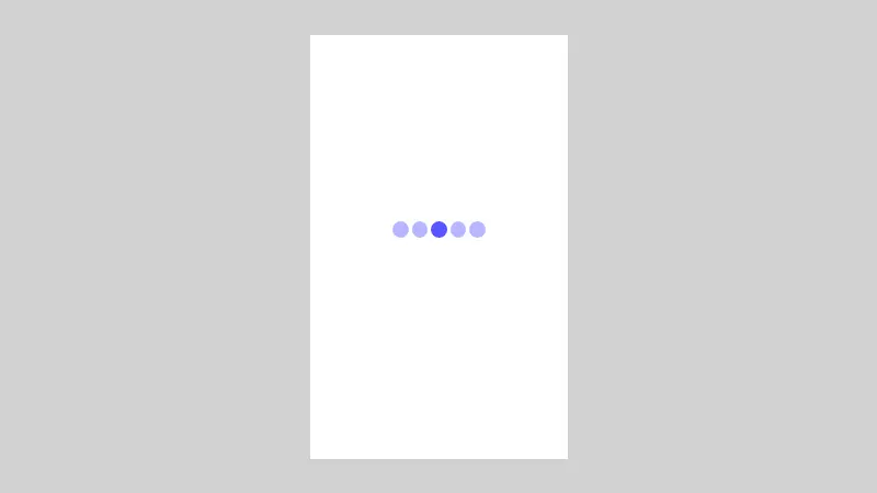
For the dots indicator, we can create one composable function and call it below the HorizontalPager as we want to show the dots below sliding pages.
- We created a lazy row and passed the total number of dots we need to show.
- We checked each index if it was the selected page index and changed the color of the dot accordingly.
@Composable
   fun DotsIndicator(
   totalDots: Int,
   selectedIndex: Int
   ) {

        LazyRow(
            modifier = Modifier
                .fillMaxWidth()
                .wrapContentHeight(), horizontalArrangement = Arrangement.Center
        ) {

            items(totalDots) { index ->
                if (index == selectedIndex) {
                    Box(
                        modifier = Modifier
                            .size(10.dp)
                            .clip(CircleShape)
                            .background(color = Color.DarkGray)
                    )
                } else {
                    Box(
                        modifier = Modifier
                            .size(10.dp)
                            .clip(CircleShape)
                            .background(color = Color.LightGray)
                    )
                }

                if (index != totalDots - 1) {
                    Spacer(modifier = Modifier.padding(horizontal = 2.dp))
                }
            }
        }
   }
The preview of the dot indicator will be like this,
Autoplay Images in Image Slider
Now we have created an Image slider with a dot indicator, the next step is to auto-play the images at a particular time interval. to do this we need to use LaunchEffect(key1= pagerState) to animate the images every 3 seconds.
If you want to jump to a specific page, you either call call pagerState.scrollToPage(index) or pagerState.animateScrollToPage(index) method in a CoroutineScope.
 LaunchedEffect(key1 = state.currentPage) {
        delay(3000)
        var newPosition = state.currentPage + 1
        if (newPosition > mainViewModel.movieListResponse.size - 1) newPosition = 0
        // scrolling to the new position.
        state.animateScrollToPage(newPosition)
    }
final MainActivity.kt
package com.velmurugan.imagesliderwithindicator

    import android.os.Bundle
    import androidx.activity.ComponentActivity
    import androidx.activity.compose.setContent
    import androidx.activity.viewModels
    import androidx.compose.foundation.Image
    import androidx.compose.foundation.background
    import androidx.compose.foundation.layout.*
    import androidx.compose.foundation.lazy.LazyColumn
    import androidx.compose.foundation.lazy.LazyRow
    import androidx.compose.foundation.lazy.items
    import androidx.compose.foundation.shape.CircleShape
    import androidx.compose.foundation.shape.RoundedCornerShape
    import androidx.compose.material.Card
    import androidx.compose.material.MaterialTheme
    import androidx.compose.material.Surface
    import androidx.compose.material.Text
    import androidx.compose.runtime.Composable
    import androidx.compose.runtime.LaunchedEffect
    import androidx.compose.runtime.mutableStateOf
    import androidx.compose.runtime.remember
    import androidx.compose.ui.Alignment
    import androidx.compose.ui.Modifier
    import androidx.compose.ui.draw.clip
    import androidx.compose.ui.graphics.Color
    import androidx.compose.ui.layout.ContentScale
    import androidx.compose.ui.text.font.FontWeight
    import androidx.compose.ui.text.style.TextAlign
    import androidx.compose.ui.tooling.preview.Preview
    import androidx.compose.ui.unit.dp
    import androidx.compose.ui.unit.sp
    import androidx.lifecycle.ViewModel
    import coil.compose.rememberImagePainter
    import coil.size.Scale
    import com.google.accompanist.pager.ExperimentalPagerApi
    import com.google.accompanist.pager.HorizontalPager
    import com.google.accompanist.pager.PagerState
    import com.google.accompanist.pager.rememberPagerState
    import com.velmurugan.imagesliderwithindicator.ui.theme.ImageSliderWithIndicatorTheme
    import kotlinx.coroutines.delay

    class MainActivity : ComponentActivity() {
        @OptIn(ExperimentalPagerApi::class)
        override fun onCreate(savedInstanceState: Bundle?) {
            super.onCreate(savedInstanceState)
            setContent {
                ImageSliderWithIndicatorTheme {
                    // A surface container using the 'background' color from the theme
                    val mainViewModel by viewModels<MainViewModel>()

                    mainViewModel.getAllMovies()

                    Surface(
                        modifier = Modifier.fillMaxSize(),
                        color = MaterialTheme.colors.background
                    ) {

                        val state = rememberPagerState()
                        Column {
                            SliderView(state, mainViewModel)
                            Spacer(modifier = Modifier.padding(4.dp))
                            DotsIndicator(
                                totalDots = mainViewModel.movieListResponse.size,
                                selectedIndex = state.currentPage
                            )

                            LazyColumn() {
                                items(mainViewModel.movieListResponse) { item ->
                                    MovieCard(movie = item)
                                }
                            }
                        }
                        LaunchedEffect(key1 = state.currentPage) {
                            delay(3000)
                            var newPosition = state.currentPage + 1
                            if (newPosition > mainViewModel.movieListResponse.size - 1) newPosition = 0
                            // scrolling to the new position.
                            state.animateScrollToPage(newPosition)
                        }
                    }
                }
            }
        }
    }

    @OptIn(ExperimentalPagerApi::class)
    @Composable
    fun SliderView(state: PagerState, viewModel: MainViewModel) {

        val imageUrl =
            remember { mutableStateOf("") }
        HorizontalPager(
            state = state,
            count = viewModel.movieListResponse.size, modifier = Modifier
                .height(200.dp)
                .fillMaxWidth()
        ) { page ->
            imageUrl.value = viewModel.movieListResponse[page].imageUrl

            Column(
                modifier = Modifier.fillMaxSize(),
                verticalArrangement = Arrangement.Top,
                horizontalAlignment = Alignment.CenterHorizontally
            ) {
                Box(contentAlignment = Alignment.BottomCenter) {

                    val painter = rememberImagePainter(data = imageUrl.value, builder = {
                        placeholder(R.drawable.placeholder)
                        scale(Scale.FILL)
                    })
                    Image(
                        painter = painter, contentDescription = "", Modifier
                            .padding(8.dp).clip(RoundedCornerShape(10.dp))
                            .fillMaxSize(), contentScale = ContentScale.Crop
                    )

                    Text(
                        text = viewModel.movieListResponse[page].name,
                        Modifier
                            .fillMaxWidth()
                            .height(60.dp)
                            .padding(8.dp)
                            .background(Color.LightGray.copy(alpha = 0.60F))
                            .padding(8.dp),
                        textAlign = TextAlign.Start,
                        fontSize = 18.sp,
                        fontWeight = FontWeight.Medium
                    )
                }

            }

        }
    }

    @Composable
    fun MovieCard(movie: Movies) {

        Card(modifier = Modifier
            .fillMaxWidth()
            .height(100.dp)) {
            Text(text = movie.name, Modifier.fillMaxWidth())

        }

    }

    @Composable
    fun DotsIndicator(
        totalDots: Int,
        selectedIndex: Int
    ) {

        LazyRow(
            modifier = Modifier
                .fillMaxWidth()
                .wrapContentHeight(), horizontalArrangement = Arrangement.Center
        ) {

            items(totalDots) { index ->
                if (index == selectedIndex) {
                    Box(
                        modifier = Modifier
                            .size(10.dp)
                            .clip(CircleShape)
                            .background(color = Color.DarkGray)
                    )
                } else {
                    Box(
                        modifier = Modifier
                            .size(10.dp)
                            .clip(CircleShape)
                            .background(color = Color.LightGray)
                    )
                }

                if (index != totalDots - 1) {
                    Spacer(modifier = Modifier.padding(horizontal = 2.dp))
                }
            }
        }
    }

    }
Conclusion
Thanks for reading. Creating an image slider is very easy using jetpack compose compare with viewpager and XML. Please try it yourself and let me know your feedback in the comments.
you can download this example on Github.
Leave a Reply