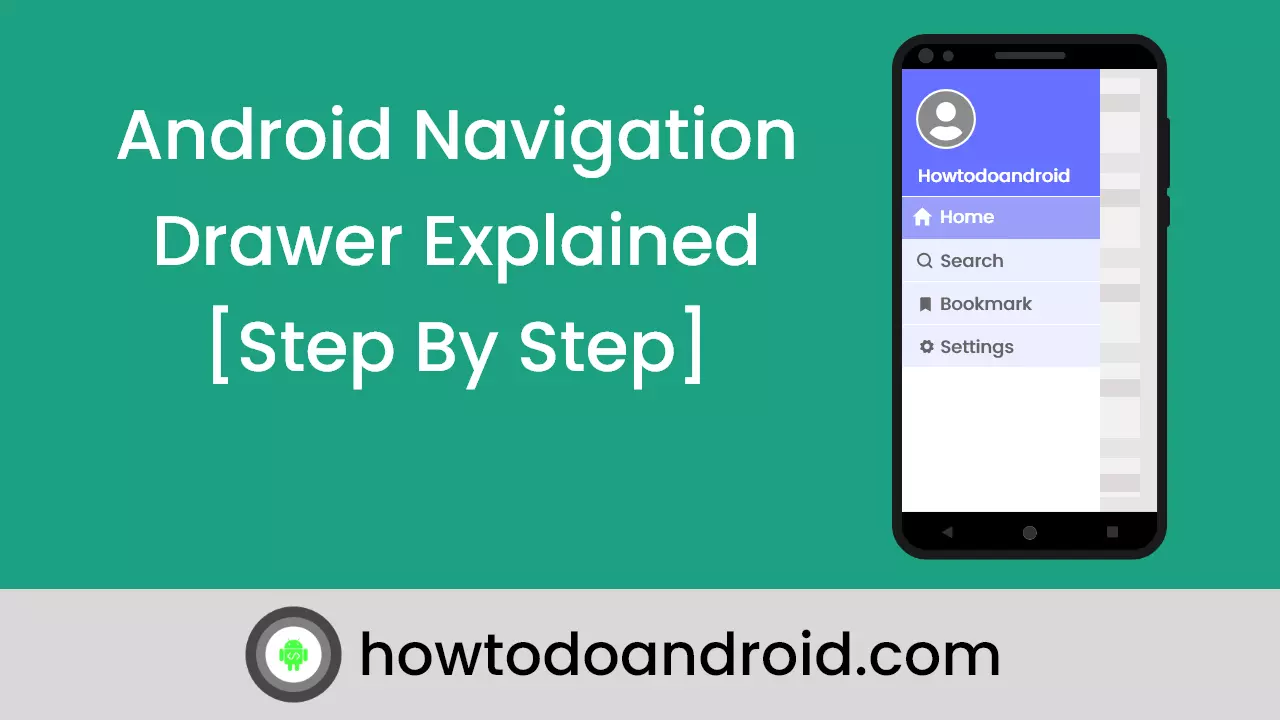
The navigation drawer is used to navigate many screens or functionalities of the app by clicking on the ‘hamburger’ icon. Swiping from the left is also a way to bring the drawer into view, a screen then slides in, showing many items. You can click on these said items and go to those screens to use that feature of the app.
Android Navigation drawer’s official document says,
Navigation drawers provide access to destinations and app functionality, such as switching accounts. They can either be permanently on-screen or controlled by a navigation menu icon.
Navigation drawers are recommended for:
- Apps with five or more top-level destinations
- Apps with two or more levels of the navigation hierarchy
- Quick navigation between unrelated destinations
Already, I have explained some of the material components in detail. check below,
Sliders — Material Component For Android
ShapeableImageView — Material Components For Android
Progress Indicators – Material Components For Android
Navigation rail – Material Component For Android
Navigation drawer with Material Design
The navigation drawer is part of the material design. So, by including the material dependency, you can access the navigation drawer.
let’s create a sample application for the android navigation drawer using material design.
Steps to create a Navigation drawer in material Design,
- Add material design dependency.
- Setup DrawerLayout.
- Setup NavigationView.
- Selecting fragment for the navigation menu Item.
Let’s see every step in detail.
Step 1 — Add material design dependency
As mentioned above, drawer layout is part of the material design. So let’s add the material design dependency.
implementation "com.google.android.material:material:1.2.0-alpha05"Step 2 — Setup DrawerLayout
In Android,DrawerLayout acts as a top-level container for window content that allows for interactive drawer views to be pulled out from one or both vertical edges of the window.
Drawer position and layout are controlled by using the layout_gravity attribute on child views corresponding to which side of view we want the drawer to emerge from like left to right.
<?xml version="1.0" encoding="utf-8"?>
    <androidx.drawerlayout.widget.DrawerLayout xmlns:android="http://schemas.android.com/apk/res/android"
        xmlns:app="http://schemas.android.com/apk/res-auto"
        xmlns:tools="http://schemas.android.com/tools"
        android:id="@+id/drawer_layout"
        android:layout_width="match_parent"
        android:layout_height="match_parent"
        android:fitsSystemWindows="true"
        tools:openDrawer="start">

        <include
            layout="@layout/app_bar_main"
            android:layout_width="match_parent"
            android:layout_height="match_parent" />

        <com.google.android.material.navigation.NavigationView
            android:id="@+id/nav_view"
            android:layout_width="wrap_content"
            android:layout_height="match_parent"
            android:layout_gravity="start"
            android:fitsSystemWindows="true"
            app:headerLayout="@layout/nav_header_main"
            app:menu="@menu/activity_main_drawer" />

    </androidx.drawerlayout.widget.DrawerLayout>
Also, under the DrawerLayout, we need to add AppBarLayout for the Toolbar and the Fragment viewholder for the FrameLayout.
app_bar_main.xml
<?xml version="1.0" encoding="utf-8"?>
    <androidx.coordinatorlayout.widget.CoordinatorLayout xmlns:android="http://schemas.android.com/apk/res/android"
        xmlns:app="http://schemas.android.com/apk/res-auto"
        xmlns:tools="http://schemas.android.com/tools"
        android:layout_width="match_parent"
        android:layout_height="match_parent"
        tools:context="com.example.velmurugan.navigationdrawerexample.MainActivity">

        <com.google.android.material.appbar.AppBarLayout
            android:layout_width="match_parent"
            android:layout_height="wrap_content"
            android:theme="@style/AppTheme.AppBarOverlay">

            <androidx.appcompat.widget.Toolbar
                android:id="@+id/toolbar"
                android:layout_width="match_parent"
                android:layout_height="?attr/actionBarSize"
                android:background="?attr/colorPrimary"
                app:popupTheme="@style/AppTheme.PopupOverlay" />

        </com.google.android.material.appbar.AppBarLayout>

        <include layout="@layout/content_main" />

        <com.google.android.material.floatingactionbutton.FloatingActionButton
            android:id="@+id/fab"
            android:layout_width="wrap_content"
            android:layout_height="wrap_content"
            android:layout_gravity="bottom|end"
            android:layout_margin="@dimen/fab_margin"
            app:srcCompat="@android:drawable/ic_dialog_email" />

    </androidx.coordinatorlayout.widget.CoordinatorLayout>
Once created the layout files, CreateActionBarDrawerTogglefor the drawer layout listener.
DrawerLayout drawer = (DrawerLayout) findViewById(R.id.drawer_layout);
            ActionBarDrawerToggle toggle = new ActionBarDrawerToggle(
                    this, drawer, toolbar, R.string.navigation_drawer_open, R.string.navigation_drawer_close);
            drawer.addDrawerListener(toggle);
            toggle.syncState();
ActionBarDrawerToggle: This is used with a DrawerLayout to implement the recommended functionality of Navigation Drawers. It has the following usages:
- Acts as a listener, for the opening and closing of drawers.
- Provides the hamburger icons in the ToolBar/ActionBar.
- It allows for the animation between the hamburger icon and the arrow to exist.
addDrawerListener(toggle): This listener is used to keep notified of drawer events.
syncState(): will synchronize the icon’s state and display the hamburger icon or back arrow depending on whether the drawer is closed or open. Omitting this line of code won’t change the back arrow to the hamburger icon when the drawer is closed.
Important Methods Of Drawer Layout
closeDrawer(int gravity): Close the drawer view by animating it into view. We can close a drawer by passing the END gravity to this method.
closeDrawers(): Close all the currently open drawer views by animating them out of view. We mainly use this method on click of any item of Navigation View.
isDrawerOpen(int drawerGravity): Used to check whether the drawer view is currently open or not. It returns true if the drawer view is open otherwise it returns false.
isDrawerVisible(int drawerGravity): Used to check whether the drawer view is currently visible on the screen or not. It returns true if the drawer view is visible otherwise it returns false.
openDrawer(int gravity): Open the drawer view by animating it into view. We can open a Drawer by passing the START gravity with this method.
Step 3 -Setup NavigationView
NavigationView is an easy way to display a navigation menu from a menu resource.
This is most commonly used in conjunction with DrawerLayout to implement Material navigation drawers. Navigation drawers are modal elevated dialogs that come from the start/left side, used to display in-app navigation links.
<com.google.android.material.navigation.NavigationView
android:id="@+id/nav_view"
android:layout_width="wrap_content"
android:layout_height="match_parent"
android:layout_gravity="start"
android:fitsSystemWindows="true"
app:headerLayout="@layout/nav_header_main"
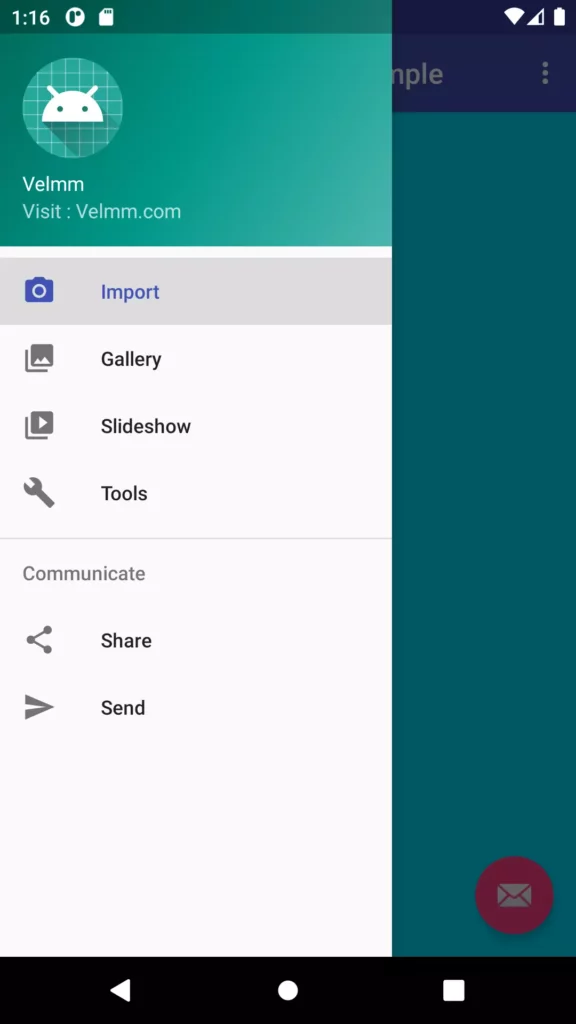
app:menu="@menu/activity_main_drawer" />The NavigationView essentially consists of two major components,
1. HeaderLayout
This View is typically displayed at the top of the Navigation Drawer. It essentially holds the profile picture, name email address, and background cover pic. This view is defined in a separate layout file that we’ll look at in a bit.

2. App Menu
After finishing creating the header we need to create a menu resource file that will hold the items to be displayed in the drawer. Here’s how to create the menu resource file:
Right-click the res folder →Select a new →Android resource file →Choose ‘menu’ under the resource type drop-down list.
Name the file as activity_main_drawer.xml and copy-paste the following code into the file.
<?xml version="1.0" encoding="utf-8"?>
    <menu xmlns:android="http://schemas.android.com/apk/res/android"
        xmlns:tools="http://schemas.android.com/tools"
        tools:showIn="navigation_view">

        <group android:checkableBehavior="single">
            <item
                android:id="@+id/nav_camera"
                android:icon="@drawable/ic_menu_camera"
                android:title="Import" />
            <item
                android:id="@+id/nav_gallery"
                android:icon="@drawable/ic_menu_gallery"
                android:title="Gallery" />
            <item
                android:id="@+id/nav_slideshow"
                android:icon="@drawable/ic_menu_slideshow"
                android:title="Slideshow" />
            <item
                android:id="@+id/nav_manage"
                android:icon="@drawable/ic_menu_manage"
                android:title="Tools" />
        </group>

        <item android:title="Communicate">
            <menu>
                <item
                    android:id="@+id/nav_share"
                    android:icon="@drawable/ic_menu_share"
                    android:title="Share" />
                <item
                    android:id="@+id/nav_send"
                    android:icon="@drawable/ic_menu_send"
                    android:title="Send" />
            </menu>
        </item>

    </menu>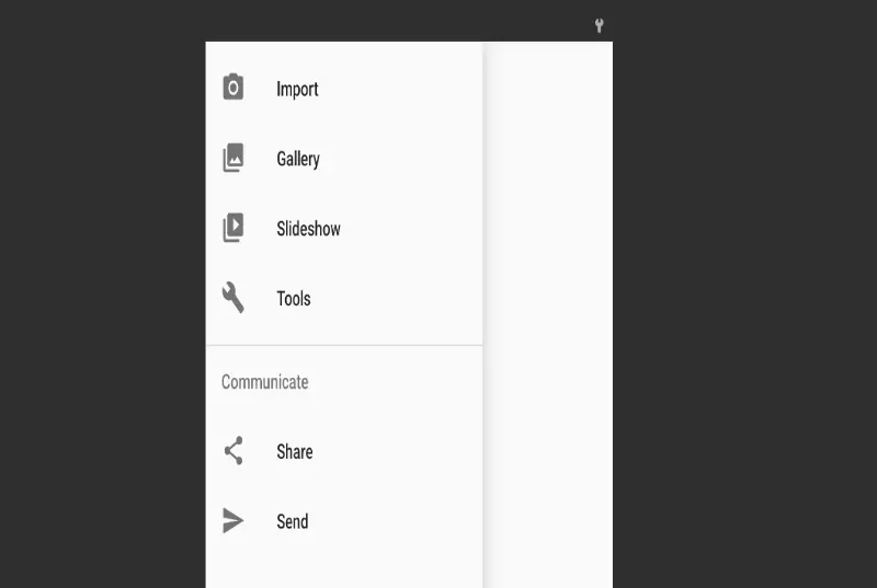
Important Methods Of NavigationView
setNavigationItemSelectedListener(NavigationView.OnNavigationItemSelectedListener listener): This method is used to set a listener that will be notified when a menu item is selected.
NavigationView navigationView = (NavigationView) findViewById(R.id.nav_view);
    navigationView.setNavigationItemSelectedListener(this);
Step 4 — Selecting fragment for the navigation menu Item
In your Activity implement the NavigationView.OnNavigationItemSelectedListener and override the onNavigationItemSelected(MenuItem item).By using the MenuItem Id we can able to launch the correct Fragment.
@SuppressWarnings("StatementWithEmptyBody")
    @Override
    public boolean onNavigationItemSelected(MenuItem item) {
        // Handle navigation view item clicks here.
        int id = item.getItemId();
        Fragment fragment = null;
        FragmentManager fragmentManager = getSupportFragmentManager();
        if (id == R.id.nav_camera) {
           fragment = new ImportFragment();
        } else if (id == R.id.nav_gallery) {
            fragment = new GalleryFragment();
        }
        fragmentManager.beginTransaction().replace(R.id.frameLayout, fragment).commit();
        DrawerLayout drawer = (DrawerLayout) findViewById(R.id.drawer_layout);
        drawer.closeDrawer(GravityCompat.START);
        return true;
    }
Display The Default Fragment
In the OnCreate() By default, we need to display the default Fragment. For that, we need to use
navigationView.setCheckedItem(R.id.nav_camera);And Also need to start the fragment for the same,
FragmentManager fragmentManager = getSupportFragmentManager();
    ImportFragment fragment = new ImportFragment();
    fragmentManager.beginTransaction().replace(R.id.frameLayout, fragment).commit();
Bonus
Navigation Drawer without Toolbar / Actionbar
Above, we have an example to create the navigation drawer with the toolbar. From that, we need to remove the toolbar layout and supportActionbar to create a navigation drawer without Toolbar / Actionbar.
DeleteAppBarLayoutfrom yourapp_bar_main.xml
<?xml version="1.0" encoding="utf-8"?>
    <android.support.design.widget.CoordinatorLayout xmlns:android="http://schemas.android.com/apk/res/android"
        xmlns:app="http://schemas.android.com/apk/res-auto"
        xmlns:tools="http://schemas.android.com/tools"
        android:layout_width="match_parent"
        android:layout_height="match_parent"
        tools:context="com.example.velmurugan.navigationdrawerexample.MainActivity">

        <include layout="@layout/content_main" />

        <android.support.design.widget.FloatingActionButton
            android:id="@+id/fab"
            android:layout_width="wrap_content"
            android:layout_height="wrap_content"
            android:layout_gravity="bottom|end"
            android:layout_margin="@dimen/fab_margin"
            app:srcCompat="@android:drawable/ic_dialog_email" />

    </android.support.design.widget.CoordinatorLayout>
delete Toolbar from ActionBarDrawerToggle your MainActivity.java
ActionBarDrawerToggle toggle = new ActionBarDrawerToggle(
                    this, drawer, R.string.navigation_drawer_open, R.string.navigation_drawer_close);
            drawer.addDrawerListener(toggle);
            toggle.syncState();
Now you can see that Toolbar has gone invisible.
That’s it. Now we created the Navigation drawer with material Design. You can download the example on Github.
Conclusion
Thanks for reading. Nowadays Android Navigation drawer will be used in most android applications. So, Please try this example and let me know your feedback in the comments.
Leave a Reply