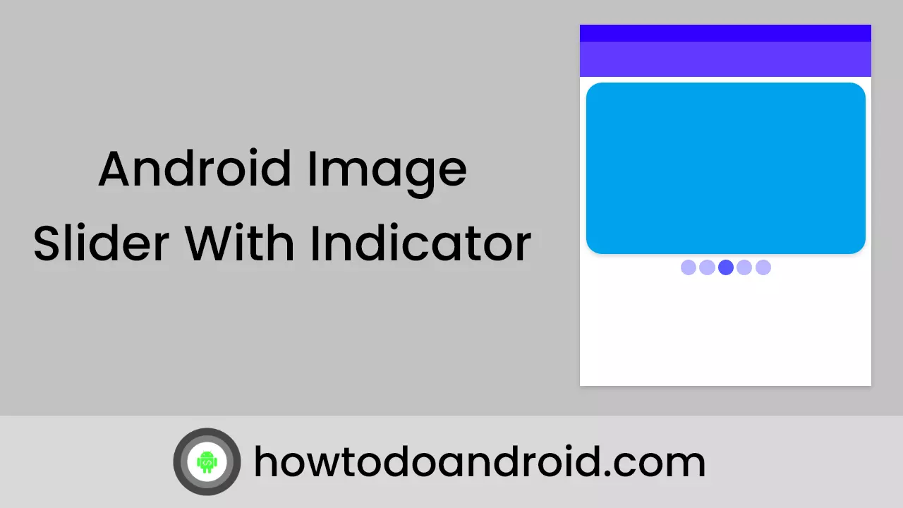
In this post, I am going to explain about creating Android Image Slider with Indicator. The automatic Image Slider is very useful to highlight the important items at the top of the screen.
With the help of a slider, We can able to show many sliders at the top of the screen. Image Slider indicator used to show the image slider count and current displaying Image slider.
Automatic image sliders have an option to slide the image slider automatically without any action.
In this android image slider example, I am using AndroidImageSlider Library. With this, You can easily load images from an internet URL, drawable, or file. And there are many kinds of amazing animations you can choose from.
Checkout image slider with indicator on jetpack compose,
Image Slider with the indicator Using Jetpack compose – Howtodoandroid
Let’s get started on creating an android image slider with an indicator example.
Adding image slider dependency
Add ImageSliderLibrary, Recyclerview, Cardview, and Material design dependencies.
Also, using the Picasso library to load image slider images.
To know more about Cardview, and Recyerview please check my other post.
implementation 'com.daimajia.slider:library:1.1.5@aar'
implementation 'com.nineoldandroids:library:2.4.0'
implementation 'com.squareup.picasso:picasso:2.3.2'
implementation 'com.google.android.material:material:1.1.0'
Create an Image Slider layout
In your activity_main.xml add a slider layout inside NestedScrollView to make the image slider scrollable.
<androidx.core.widget.NestedScrollView
            android:layout_width="match_parent"
            android:layout_height="wrap_content"
            android:scrollbars="none">

            <LinearLayout
                android:layout_width="match_parent"
                android:layout_height="wrap_content"
                android:focusableInTouchMode="true"
                android:orientation="vertical">

                <com.daimajia.slider.library.SliderLayout
                    android:id="@+id/sliderLayout"
                    android:layout_width="fill_parent"
                    android:layout_height="250dp" />

                <androidx.recyclerview.widget.RecyclerView
                    android:id="@+id/recyclerview"
                    android:layout_width="match_parent"
                    android:layout_height="match_parent"
                    android:orientation="vertical"
                    tools:listitem="@layout/recyclarview_adapter"
                    android:scrollbars="none" />
Setup Slider with indicator

1. Prepare data for the automatic image slider
Add Slider Image And Title into the HashMap And Set it into the slider Layout.
sliderImages = new HashMap<>();
    sliderImages.put("Great Indian Deal", R.drawable.amazon_1);
    sliderImages.put("New Deal Every Hour",R.drawable.snapdeal_1);
    sliderImages.put("Appliances Sale", R.drawable.amazon_2);
    sliderImages.put("UnBox snapdeal",R.drawable.snapdeal_2);
    sliderImages.put("Great Deals", R.drawable.amazon_3);
2. Add an Image Slider with data
TextSliderView is used to display the Slider Image and the title at the bottom of the image slider.
TextSliderView Methods
description() – To set the Description for the Slider Image.
image() — Set the Slider Image.
setScaleType() — Set ScaleType for the Image.
setOnSliderClickListener() — Set Click Listener for the Image Slider.
By using, the prepared data create TextSliderView. and then add it to the slider layout.
for (String name : sliderImages.keySet()) {

        TextSliderView textSliderView = new TextSliderView(this);
        textSliderView
                .description(name)
                .image(sliderImages.get(name))
                .setScaleType(BaseSliderView.ScaleType.Fit)
                .setOnSliderClickListener(this);
        textSliderView.bundle(new Bundle());
        textSliderView.getBundle()
                .putString("extra", name);
        sliderLayout.addSlider(textSliderView);
    }
3. slider layout configuration
Already, we set the slider into a slider layout. Now, we are adding indicator and animation configuration to the android image slider.
Slider Layout Methods
setPresetIndicator() — Used to set the Position for the Dot Indicator.
setCustomAnimation() — Set the Animation for the Image Slider.
setDuration() — used to set the Image Sliding interval.
addOnPageChangeListener() — Provide the callback method for the Image Slider changes.
Also, SliderLayout has the interface for the callback on click and slider image indicator changes.
@Override
    public void onSliderClick(BaseSliderView slider) {

    }

    @Override
    public void onPageScrolled(int position, float positionOffset, int positionOffsetPixels) {

    }

    @Override
    public void onPageSelected(int position) {

    }

    @Override
    public void onPageScrollStateChanged(int state) {

    }
code for the slider Layout configuration,
sliderLayout.setPresetTransformer(SliderLayout.Transformer.Accordion);
    sliderLayout.setPresetIndicator(SliderLayout.PresetIndicators.Center_Bottom);
    sliderLayout.setCustomAnimation(new DescriptionAnimation());
    sliderLayout.setDuration(3000);
    sliderLayout.addOnPageChangeListener(this);
we are done with the android image slider example. Please download the example from GitHub.
Conclusion
Thank you for the reading. Please try this and let me know your feedback in the comments.
Leave a Reply