Android Chips are one of the components of the Material Design library. A Material Chip is a component that can represent the input, filter, choice, or action of a user.
A Material Chip represents a complex entity in a small block, such as a contact. It is a rounded button that consists of a label, an optional chip icon, and an optional close icon. A chip can either be clicked or toggled if it is checkable.
Chips may be placed in a, which can be configured to layout its chips in a single horizontal line or reflowed across multiple lines. If a chip group contains checkable chips, it can also control the multiple-exclusion scope for its set of chips so that checking one chip unchecks all other chips in the group. — Material.io
Setup Material Chips in your Android Studio
To use Chips, your project needs to have material components dependency.
implementation 'com.google.android.material:material:1.1.0-alpha05'Also, set your app theme such that it inherits one of the Material Components themes.
<style name="AppTheme" parent="Base.Theme.MaterialComponents.Light">
            <!-- Customize your theme here. -->
            <item name="colorPrimary">@color/colorPrimary</item>
            <item name="colorPrimaryDark">@color/colorPrimaryDark</item>
            <item name="colorAccent">@color/colorAccent</item>
    </style>
Usage
The Chip widget provides a complete implementation of Material Design’s chip component. Example code of how to include the widget in your layout:
 <com.google.android.material.chip.Chip
android:layout_width="wrap_content"
android:layout_height="wrap_content"
android:text="@string/hello_world"/>
Types Of Material Chip
There are four types of chips: Entry (Input) Chips, Filter Chips, Choice Chips, and Action Chips. Chips are generally used with ChipGroup which is to hold a number of chips.
1. Entry (Input) Chips
An entry chip is used to display captured user input in a non-editable format. It’s a very nice way to showcase the user input.
One of the most obvious usages of the Android Entry chip is shown in the Gmail app. Particularly the email input experience- when an email is entered by the user, it is showcased as an entry chip, sort of a pill-shaped layout.
Now according to the material design, this element should be an Android Chip with the style of ‘Entry’. This chip can also have a close icon along with a chip icon. Generally, this type of chip is contained in a ChipGroup.
ChipGoup class is similar to the RadioGroup class, as it is used to hold multiple chips. It has the property to display all the chips in a single line.
<com.google.android.material.chip.ChipGroup
            android:id="@+id/chip_group"
            android:layout_width="0dp"
            android:layout_height="wrap_content"/>
Adding text to Entry Chip programmatically.
private fun addChipToGroup(person: String) {
            val chip = Chip(context)
            chip.text = person
            chip.chipIcon = ContextCompat.getDrawable(requireContext(), R.drawable.ic_launcher_background)
            chip.isChipIconVisible = false
            chip.isCloseIconVisible = true
            // necessary to get single selection working
            chip.isClickable = true
            chip.isCheckable = false
            chip_group.addView(chip as View)
            chip.setOnCloseIconClickListener { chip_group.removeView(chip as View) }}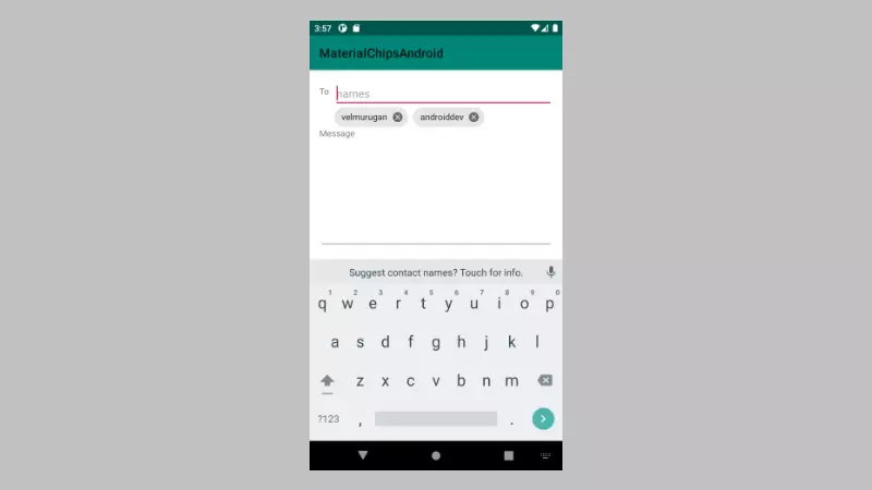
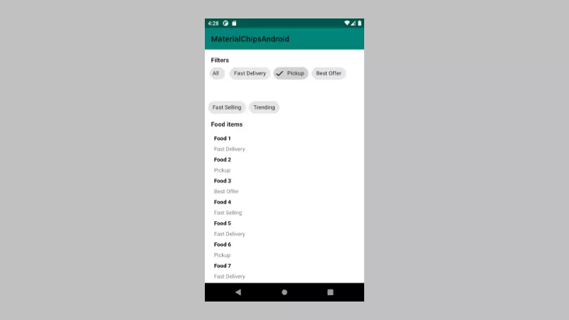
2. Filter Chip
Filter chips would start acting as a radio button. This means in a way only one selection can be made at a time. This functionality is achieved by adding all the filter chips in a ChipGroup and setting the property app:singleSelection=”true” of Chip Group.
<com.google.android.material.chip.ChipGroup
                android:layout_width="0dp"
                android:layout_height="wrap_content"
                app:singleSelection="true"
                app:layout_constraintEnd_toEndOf="parent"
                android:layout_marginEnd="8dp"
                app:layout_constraintStart_toStartOf="parent"
                android:layout_marginStart="8dp"
                android:id="@+id/chip_group_filter"
                app:layout_constraintTop_toBottomOf="@+id/text_filter"
                >
            <com.google.android.material.chip.Chip
                    style="@style/Widget.MaterialComponents.Chip.Filter"
                    android:layout_width="wrap_content"
                    android:text="Fast Delivery"
                    android:layout_height="wrap_content"
                    android:id="@+id/chip2"
                    />
            <com.google.android.material.chip.Chip
                    style="@style/Widget.MaterialComponents.Chip.Filter"
                    android:layout_width="wrap_content"
                    android:text="Pickup"
                    android:layout_height="wrap_content"
                    android:id="@+id/chip3"
                    />
            <com.google.android.material.chip.Chip
                    style="@style/Widget.MaterialComponents.Chip.Filter"
                    android:layout_width="wrap_content"
                    android:text="Best Offer"
                    android:layout_height="wrap_content"
                    android:id="@+id/chip4"
                    />
            <com.google.android.material.chip.Chip
                    style="@style/Widget.MaterialComponents.Chip.Filter"
                    android:layout_width="wrap_content"
                    android:text="Fast Selling"
                    android:layout_height="wrap_content"
                    android:id="@+id/chip5"
                    />
    </com.google.android.material.chip.ChipGroup>
Click Listener for the Filter Chip group,
chip_group_filter.setOnCheckedChangeListener { group, checkedId ->
                val chip: Chip? = group.findViewById(checkedId)
                chip?.let {chipView ->
                    val predicate: (Items) -> Boolean = {item->
                        item.category == chipView.text
                    }
                    val filter = prepareData().filter(predicate)
                    adapter?.setData(filter)
                } ?: kotlin.run {
                    adapter?.setData(prepareData())
          }
    }
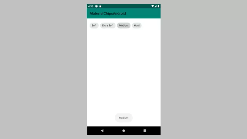
3. Choice Chip
The choice chip allows the user to select only one of the available options just like the filter chips. But with one difference, it does not have a check icon on it.
Instead according to material design guidelines, it displays the selection with a change of color, when it is selected. If you wish you can use chipIconthis chip.
defining the choice chip in XML.
<com.google.android.material.chip.ChipGroup
                android:layout_width="0dp"
                app:singleSelection="true"
                android:layout_height="wrap_content"
                android:layout_marginTop="8dp"
                app:layout_constraintTop_toTopOf="parent"
                app:layout_constraintStart_toStartOf="parent"
                android:layout_marginStart="8dp"
                app:layout_constraintEnd_toEndOf="parent"
                android:layout_marginEnd="8dp"
                android:id="@+id/chip_group_choice"
                >
            <com.google.android.material.chip.Chip
                    android:layout_width="wrap_content"
                    android:text="Soft"
                    style="@style/Widget.MaterialComponents.Chip.Choice"
                    android:layout_height="wrap_content"
                    android:id="@+id/chip1"
                    />
            <com.google.android.material.chip.Chip
                    android:layout_width="wrap_content"
                    android:text="Extra Soft"
                    style="@style/Widget.MaterialComponents.Chip.Choice"
                    android:layout_height="wrap_content"
                    android:id="@+id/chip2"
                    />
            <com.google.android.material.chip.Chip
                    android:layout_width="wrap_content"
                    android:text="Medium"
                    style="@style/Widget.MaterialComponents.Chip.Choice"
                    android:layout_height="wrap_content"
                    android:id="@+id/chip3"
                    />
            <com.google.android.material.chip.Chip
                    android:layout_width="wrap_content"
                    android:text="Hard"
                    style="@style/Widget.MaterialComponents.Chip.Choice"
                    android:layout_height="wrap_content"
                    android:id="@+id/chip4"
                    />
        </com.google.android.material.chip.ChipGroup>
handling ChoiceChip selection on chip group.
chip_group_choice.setOnCheckedChangeListener { group, checkedId ->
                val chip: Chip? = group.findViewById(checkedId)
                chip?.let {chipView ->
                    Toast.makeText(context, chip.text, Toast.LENGTH_SHORT).show()
                } ?: kotlin.run {
                }
    }
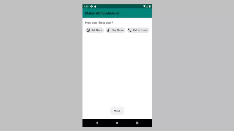
4. Action Chip (Default)
It’s a single actionable chip, in short, it’s an alternative to the button widget. If you have to perform an action, based on the user’s tap, this is the chip that you should use. Generally, this type of chip is placed after the content of the page and is used as a clickable, just like a button.
<com.google.android.material.chip.ChipGroup
                    android:layout_width="0dp"
                    android:layout_height="wrap_content"
                    android:id="@+id/chip_group_action"
                    android:padding="10dp"
                    app:singleLine="true"
                    app:singleSelection="true"
                    app:chipSpacingHorizontal="10dp"
                    style="@style/Widget.MaterialComponents.Chip.Action"
                    >
                <com.google.android.material.chip.Chip
                        android:layout_width="wrap_content"
                        android:layout_height="wrap_content"
                        android:id="@+id/chip_alarm"
                        style="@style/Widget.MaterialComponents.Chip.Action"
                        android:text="Set Alarm"
                        app:chipIcon="@drawable/ic_access_alarm_black_24dp"
                        />
                <com.google.android.material.chip.Chip
                        android:layout_width="wrap_content"
                        android:layout_height="wrap_content"
                        android:id="@+id/chip_music"
                        android:text="Play Music"
                        style="@style/Widget.MaterialComponents.Chip.Action"
                        app:chipIcon="@drawable/ic_music_note_black_24dp"
                        />
                <com.google.android.material.chip.Chip
                        android:layout_width="wrap_content"
                        android:layout_height="wrap_content"
                        android:id="@+id/chip_call"
                        android:text="Call to Friend"
                        style="@style/Widget.MaterialComponents.Chip.Action"
                        app:chipIcon="@drawable/ic_call_black_24dp"
                        />
                <com.google.android.material.chip.Chip
                        android:layout_width="wrap_content"
                        android:layout_height="wrap_content"
                        android:id="@+id/chip_message"
                        android:text="Send Message"
                        style="@style/Widget.MaterialComponents.Chip.Action"
                        app:chipIcon="@drawable/ic_message_black_24dp"
                        />
            </com.google.android.material.chip.ChipGroup>
Implementation click listener for the ActionChips.
chip_alarm.setOnClickListener {
                Toast.makeText(context, "Alarm", Toast.LENGTH_SHORT).show()
            }
            chip_music.setOnClickListener {
                Toast.makeText(context, "Music", Toast.LENGTH_SHORT).show()
            }
            chip_call.setOnClickListener {
                Toast.makeText(context, "Call", Toast.LENGTH_SHORT).show()
            }
            chip_message.setOnClickListener {
                Toast.makeText(context, "Message", Toast.LENGTH_SHORT).show()
    }
Android Chips Attributes
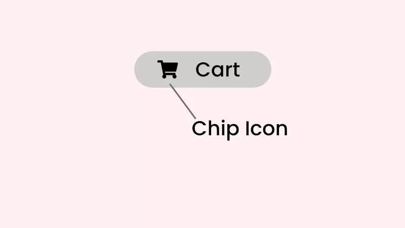
Chip Icon
app:chipIconVisible — visibility of the chip icon.
app:chipIcon – drawable icon to show at the start of the chip.
app:chipIconSize — the size of the chip icon.
Click listener for the clip icon,
chip.setOnClickListener {
       // Handle chip click
    }
Close Icon
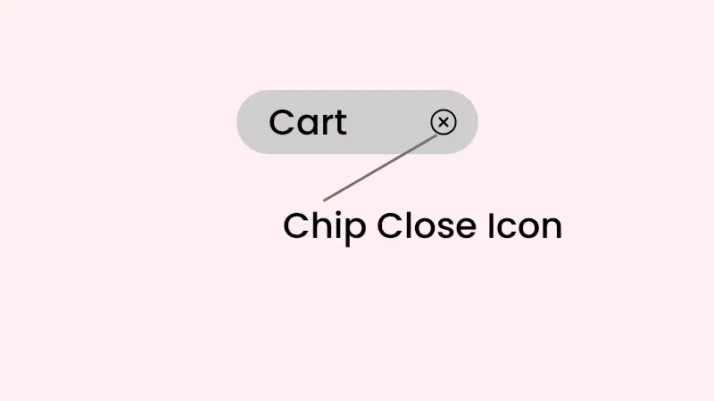
app:closeIconVisible – visibility of the close icon.
app:closeIcon — drawable icon shown at end of the chip.
app:closeIconSize — the size of the close icon.
Click listener for the close icon,
chip.setOnCloseIconClickListener {
        // Handle chip close icon click
    }
Checked Icon
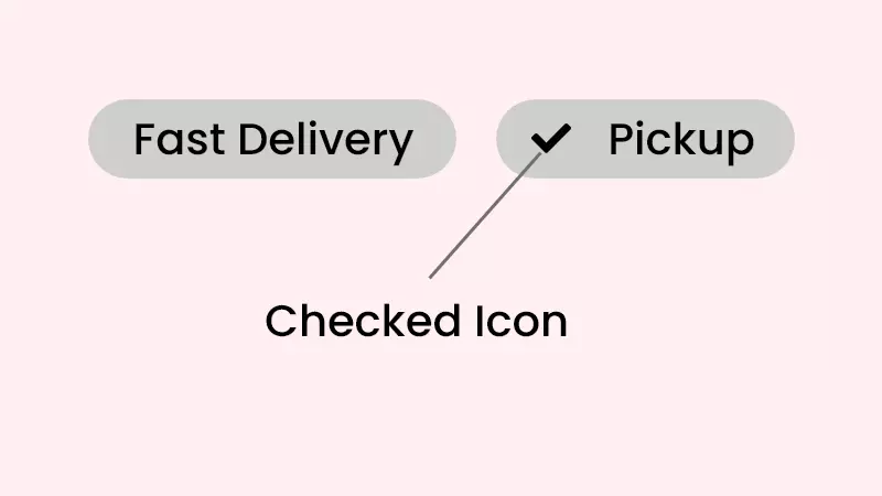
android:checkable — Whether or not checkable tapping is enabled.
app:checkedIconVisible — visibility of the checked icon.
app:checkedIcon — drawable to show after the user toggled the chip button.
Click listener for the checked icon,
chip.setOnCheckedChangeListener { chip, isChecked ->
        // Handle chip checked/unchecked
    }
Color
chipBackgroundColor — used to customize the chip background.
textColor — customize the text color.
chipIconTint — the color of the Chip icons can be customized
closeIconTint — Color of the close icon in the chip.
hipStrokeColor — stroke color of the chip.
Android ChipGroup Attributes
singleLine — Put all the Chips under the chip group in a single line.
<com.google.android.material.chip.ChipGroup
            android:id="@+id/chip_group_filter"
            android:layout_width="0dp"
            android:layout_height="wrap_content"
            app:singleLine="true">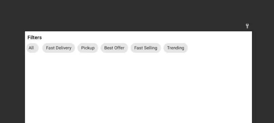
chipSpacingVertical — Vertical space between two chips in the chip group.
<com.google.android.material.chip.ChipGroup
            android:id="@+id/chip_group_filter"
            android:layout_width="0dp"
            android:layout_height="wrap_content"
            app:chipSpacingVertical="40dp">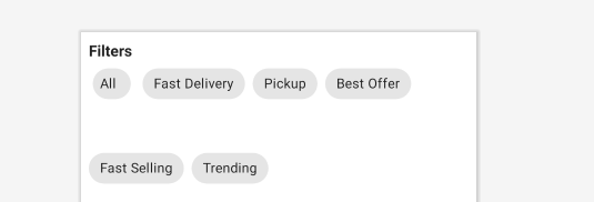
chipSpacingHorizontal — Horizontal space between two chips.
<com.google.android.material.chip.ChipGroup
            android:id="@+id/chip_group_filter"
            android:layout_width="0dp"
            android:layout_height="wrap_content"
            app:chipSpacingHorizontal="40dp">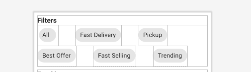
singleSelection – The singleSelection attribute can be set to true on a ChipGroup in order to toggle the single-select and multi-select behavior of child Chips.
selectionRequired — The selectionRequired the attribute can be set to true on a ChipGroup to prevent all child Chips from being deselected.
That’s all. Done with the Android chip explanation.
You can download my Android Chips Material Design example on Github.
Check my other example using Material design.
Cardview Android Example [Beginners]
Android Navigation Drawer Explained [Step By Step]
Bottom Sheets – Material Components for Android
Finally
Thanks for reading. Please try Material chips in your application. And let me know your feedback in the comments.
Leave a Reply